by Wallace Wyss –
Being a child of the Midwest, I didn’t see many sports cars. Oh, I knew there were Jag-U-Ars and Furr-arris but just didn’t see them.
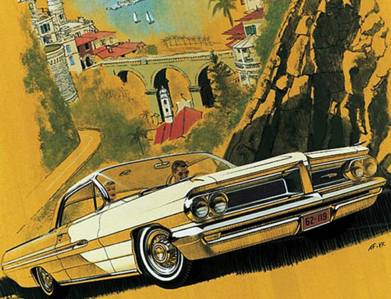
But then in the early ’60s, Pontiac ads started showing American cars in European backgrounds and American cars became more exciting to me. Pontiac especially with this new car called the Grand Prix. Now I wasn’t actually sure what a “Grand Prix” was, some kind of race over in Yurrip.
Maybe single seaters. But this Grand Prix had a deep set grille, and wheels that looked oh-so-mechanical, and a center shifter and some kind of gauge in the floor in the middle, maybe vacuum gauge (why would you care about vacuum?).
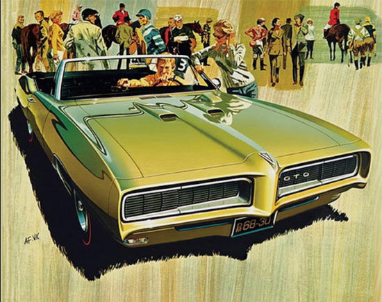
The Pontiac ads that turned my head toward art were those by Van and Fitz, the “Fitz” being Art Fitzpatrick (the late AFAS member) and the “Van” being Van Kaufman.
What made the Van and Fitz illustrated ads, which represented Pontiac from ’62 to ’70, memorable to me was the fact that they dared to show American cars in European backgrounds. Americans had been led by magazines like Road & Track to think American cars were totally inferior to European cars on European turf. Laughably inept, running out of brakes the first trip down the Alps (actually driving a ’48 Chevy down an Alp is one of the most memorable events of my life…)
When you look back at the earlier Van and Fitz drawings, though, what you see is a certain amount of well, what should I call it—manipulation?
Either the cars were artificially widened from their proportions in real life or else the people were depicted artificially small. Of course they did that with the photos in car ads before that, I remember one time walking through a Detroit newspaper photo lab, and finding some prisms and finding out they used prisms to make cars look longer, lower and wider.
Van and Fitz kept up that illusion for a few years.
The choice of Van and Fitz to create an image for Pontiac I credit to the genius of John Zachery DeLorean. It was he who approved the name “Grand Prix” even if he knew that Americans weren’t quite sure what a Grand Prix was. He also approved of the moniker “2-plus-2” which sounded oh-so-Continental and began to use the metric equivalent for displacement though some still had cubic inch names like “421”.
When Van and Fitz showed foreign cars in the background they were always kept sort of vague, not tightly rendered like the Pontiacs so as not to distract you from the main subject.
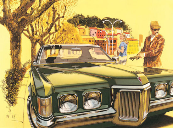
The scenery was Monte Carlo or European streets fancified beyond belief, and, as an American boy, I was damn proud of an American car being able to go where European cars regularly traveled.
In one ad in particular, you see the elegant dude who owns the car putting on driving gloves. Imagine—an American car that you could drive with such brio that you needed driving gloves!
Decades later when I was over in Italy visiting automakers, I borrowed an Alfa from Alfa Romeo and drove roads along the coast and found that, hey, even in an Alfa, the roads that follow the coast are so twisty (first or second gear only) that even with an Alfa made in Italy you couldn’t go very fast. I thought of Van and Fitz and felt slightly betrayed, i.e. “But what about the Pontiacs portrayed by Van and Fitz?” I wanted to ask. “How did they negotiate these roads?”
Donate to My Car Quest – Click Here
Well, I suspect they would have answered those questions with a smile and say, “My boy, those drawings were fantasies.” Because you won’t want to take a 3800 lb. Grand Prix to small Italian and French Riviera towns…trust me.
When Pontiac came out with the Trans-Am in ’69 they already began transitioning to photography and while the first Trans Am ads for the ’70 ½ model were absolutely stunning in their photography, magic was lost compared to the drawings by Van and Fitz. Oh, I found a 1971 Trans Am they had rendered but by that time the longer-lower-wider thing was over, and that Trans Am was done in an restrictive overly tight style that lacked what their early ’60s illustrations had.
What was lost? The romance. By the time Pontiac went to photography only, an era was over.
Decades later when I met Fitz at AFAS preview parties at Pebble Beach (they have a nice art tent at the Pebble Beach concours), he would tell Brian Winer (a huge Fitz fan) and me about how McManus John & Adams Advertising paid for them to go to Europe and sketch backgrounds just for those ads, which I think was very enlightened of the agency. The drawings show their love of European ornateness and the terrain and all that transferred to the car.
I’m not saying Van and Fitz started automotive art in America, but for one brief shining period, say 1962-’70, they introduced Americans to the idea that art, not photographs, can convey something about the image of a car.
Hey, they sold me…
Wallace Wyss
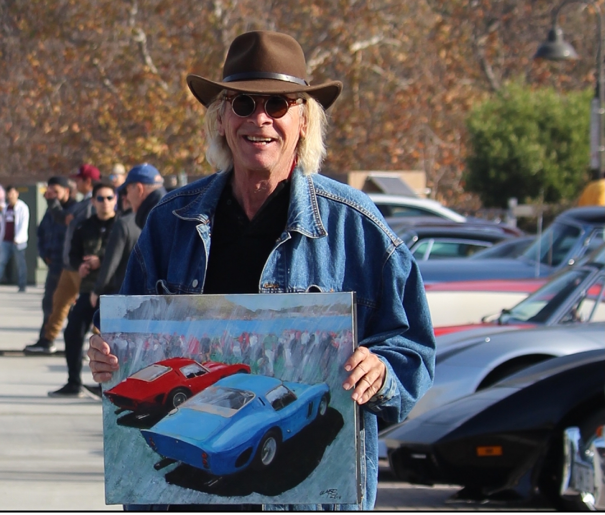
THE AUTHOR, Wallace Wyss, is a fine artist as well. For a list of prints from his original paintings, one can write photojournalistpro2@gmail.com

![autoartreview-van-fritz-grand-prix[1]-1](https://mycarquest.com/wp-content/uploads/2019/05/autoartreview-van-fritz-grand-prix1-1-550x500.jpg)


I HAD TWO EUROPEAN CARS, FROM THE 60s, WITH QUAD HEAD LIGHTS. ONE, 1965 FERRARI 330 GT , AND ONE 1962 FACEL VEGA II. SEVERAL AMERICAN CARS.
The elegant dude was actually the artist, my father, Van Kaufman. He loved that leather jacket. KK