After a walk around I hereby pronounce it as a Ferrari beater (looks-wise).
Text by Wallace Wyss – photographs by Richard Bartholomew
You kind of wonder, of late, where Aston Martin is going. Do they in fact, have a direction that’s in any way consistent?
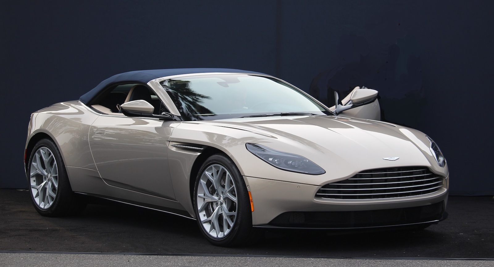
After previously seeing the Aston Martin DB11 coupe in person, I didn’t think I’d be that much more impressed by the open version, but as dramatically unveiled by O’Gara Coach in West Hollywood at the monthly Sunset Plaza Cars ‘N Coffee, it flat knocked me over. Here’s why:
SIDE VIEW: The rear fenders, bulging out and squared off at the top (where designers call the “catwalk”) are almost Camaro-ish, or similar to those on the Bentley Speed Six prototype, but the brilliant part of the side view is the way the engine air exhaust grate (didn’t check if it was functional) is blacked out on its forward edge, giving the illusion that there’s a clamshell bonnet (lifting the fenders with it). The upward slanting “ledge” in the side door also gives the side some drama, but without overdoing it too much as on the Camaro where the sculpture seems demanding too much attention.
But the really impressive part of this convertible was the thin C-pillar (no B pillar) convertible top that dispenses with the “privacy” that some convertibles offer in the rear ¾ views. This top gives you a lighter, more airy feeling, as there’s just enough top to protect you from the elements but not one that is so big it is insisting on being weatherproof enough for the Arctic Circle!
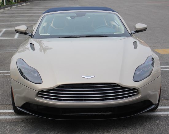
FRONT VIEW: By having no bonnet seat at the front, it almost throws away the thought that there has to be, by law, a certain about of crush zone underneath. I remember when “safety bumpers” first came in, the result was huge front bumpers that looked like railroad ties in chrome. Now Aston has shown that you can have the energy absorption but not sacrifice the front end in any way to kow-tow to that regulation.
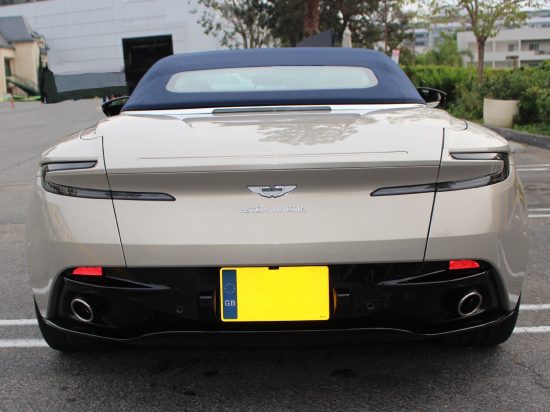
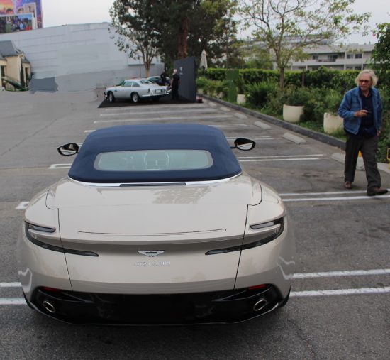
REAR VIEW: The only disappointment for me but necessary, was to link it to the existing DB11 coupe rear view taillights. I would have rather have dispensed with the body color bar in the middle “interrupting” the taillights and instead had a new shape taillamp that could be exclusive only for the open car.
The Aston Martin lettering, in all caps on the back, was also very disappointing. It may be cast in their type font but it looks all too generic, like stick on letters you would buy in a handicrafts shop. I would expect something very individualistic. Anybody remember that first Lamborghini prototype with the stylized signature of Ferrucio in chrome? That was befitting an expensive car.
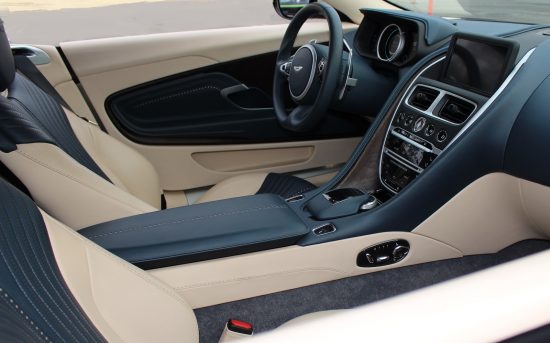
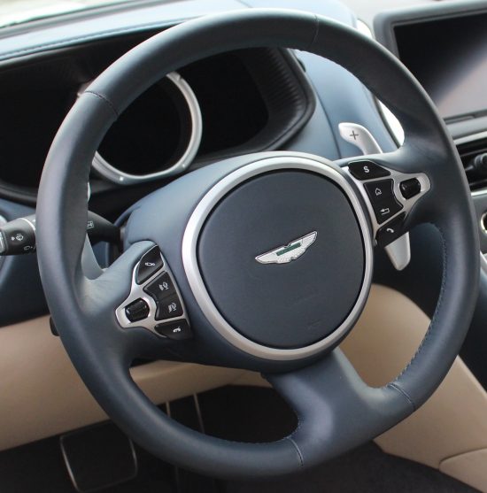
INTERIOR: Alas, I don’t know if there is a wood option but call me Old Skool, I want my British luxury cars with wood. When I think of the beautiful wood I saw in an old restored Facellia II roadster the other day (it may have been painted wood as in the Facel II) I lament that modern automakers don’t think wood is a necessary part of a sports car dash anymore.
COLOR: It helped that the car O’Gara presented was painted some very odd color of light green, that was way too European for American tastes, and I haven’t seen the color palette but I am hoping there are more nature-related colors rather than the Rosso Corso and Giallo Yellow and garish Ferrari palette that screams “Look at what I’m driving…”
IN SUM: I really think, of all the Aston Martins I have seen lately, this one really has a chance of competing effectively in the showrooms with the likes of the Mercedes-AMG S65 Cabriolet, Bentley Continental GT Convertible, or Ferrari California because it’s:
1.) not loud
2.) more subtle
3.) more classy, and is especially effective against the Ferrari because it has no screaming boy-racer affectations (raised rear spoilers, huge air scoops).
Oh, there are Aston race cars to be sure but none of the racetrack-useful body parts have come to his car. O’Gara has displayed racing Astons but this new DB11 convertible is the Rodeo Drive Aston that could be lightly wafted down Rodeo Drive and still be driven through the back roads of Malibu with aplomb.
Good job, Aston.
Let us know what you think in the Comments.
THE AUTHOR: Wallace Wyss is a fine artist currently busy portraying sports cars on canvas. For info. on commissioning an oil, write Photojournalistpro2@gmail.com.
Richard Bartholomew, of Riverside, CA, is a fine artist.



I understand Aston Martin has a new method of retaining the downforce on the rear without a wing or spoiler at the extreme back of the car.
The new Aston looks fine.
But I will stick to that DB5 in the background.
Gorgeous car!
Lovely car over all, the rear end treatment is very heavy and the tail lights are almost an afterthought… the trunk shut line is very awkward other than that the car is very nice…
Hi Wallace. When PR for the DB11 Volante kicked-in to full gear a couple of weeks ago I posted a stunning photo of it sitting pretty near a modern dessert home at Golden Hour (see link provided) – on my personal Facebook page. The response from my friends, family, colleagues and many Car Guys was hands-down a big thumb’s-up. I admit that looking at the rear from the angles in your report is making me be a bit more critical of its design. Not sure Mike allows links to other blogs from his, but here’s the link that had the pictures and story I read…
https://gearpatrol.com/2017/10/13/2018-db11-volante-convertible-sports-car-grand-tourer-pictures/#4
Yes, Jim, thanks for posting that link. I really like that color Aston against the Palm Springs background. Somewhere on the net there’s a front 3/4 view a bit more from the front as well. I’ll admit the rear has an awkward angle, sort of heaviness, and am looking forward to any comments that might come from car designers on a Car Design thread on a Ferrari website. I am sure Detroit designers only dream of creating such unfettered design but when it’s not a $200,000 car there’s always some budgetary considerations raining on their parade so to speak.
I ran this same article with different pics on Ferrarichat.com in the Car Design thread and here’s two professional car designers comments so far. Love to hear what the pros think!
2.energy88 said:
“Very nice overall. My only suggestion is that the grill opening could have been made more interesting by exaggerating the amount of “dip” (~1″) between the hood bulge line and the headlight. ”
of2worlds said:
“Quite refined, especially how they did the small appearing soft top. The only quibble would be the large dark area below the tail lights were the lic plate is mounted. Perhaps made more noticeable with the light paint color to. That dark area makes the car look unfinished. Still overall a crisp clean design that really shows off those nice Rubenesque hips behind the doors!”