by Wallace Wyss
Well, the good news it is a V12. And it’s a color besides red.
The bad news is that the new F60 America is a pastiche of different design sub-themes, all conglomerated together on one car for a “quick sale.”
It reminds you of some real estate “flipper” buying a house on Monday and adding some quick gimmicks like coach lamps, brass things for the front doors, shrubs, etc….,so it’ll look better when it goes on sale on Tuesday.
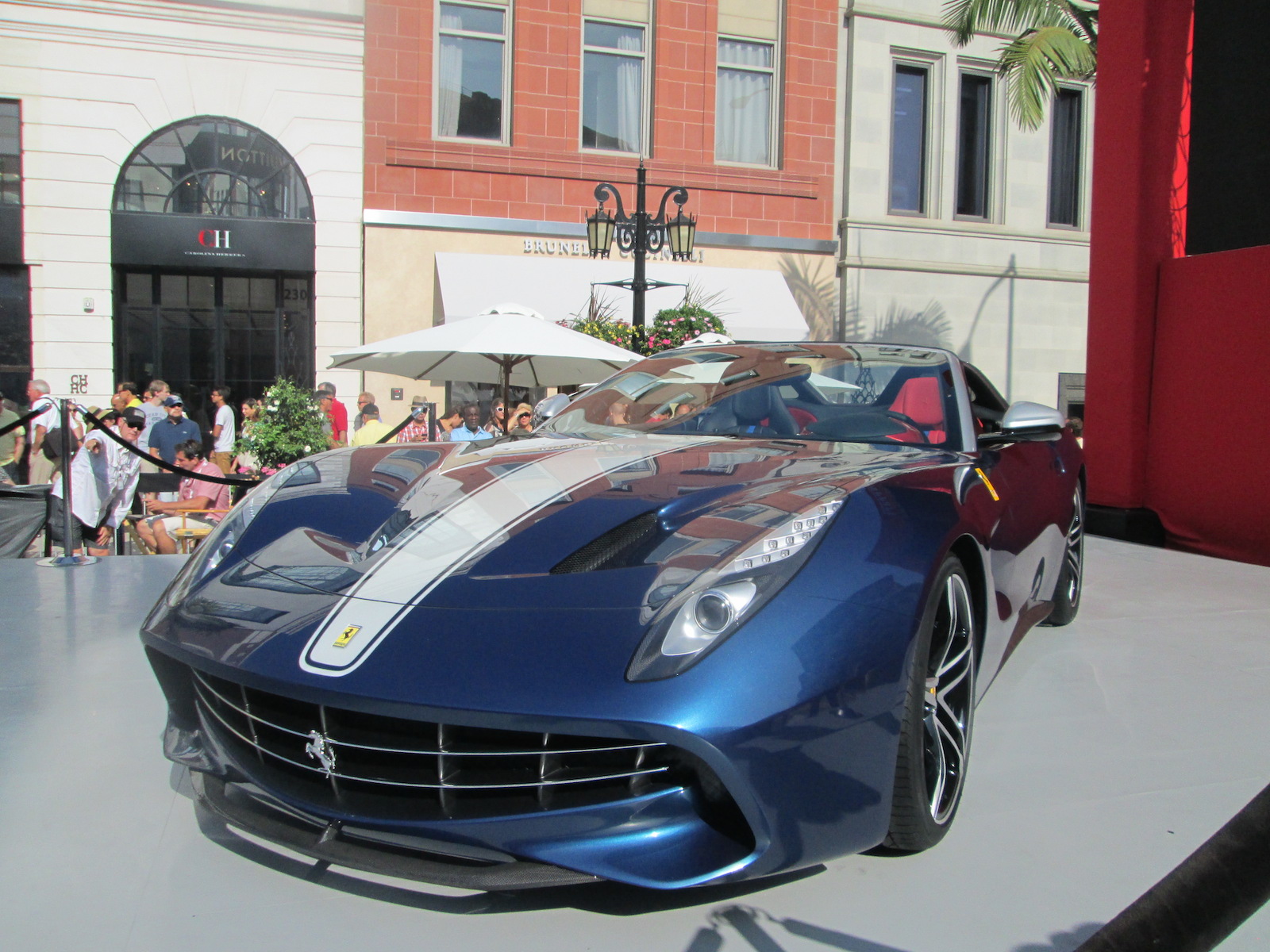
The car was introduced in Beverly Hills on October 13, 2014 at a special Ferrari 60th anniversary promotion. A Ferrari official told me it was priced at $3.1 million each, higher than other prices I have read in the press. I say “priced” past tense because all ten are sold.
Ferrari F60 America
Ferrari F60 America
Here’s my critique for what it’s worth:
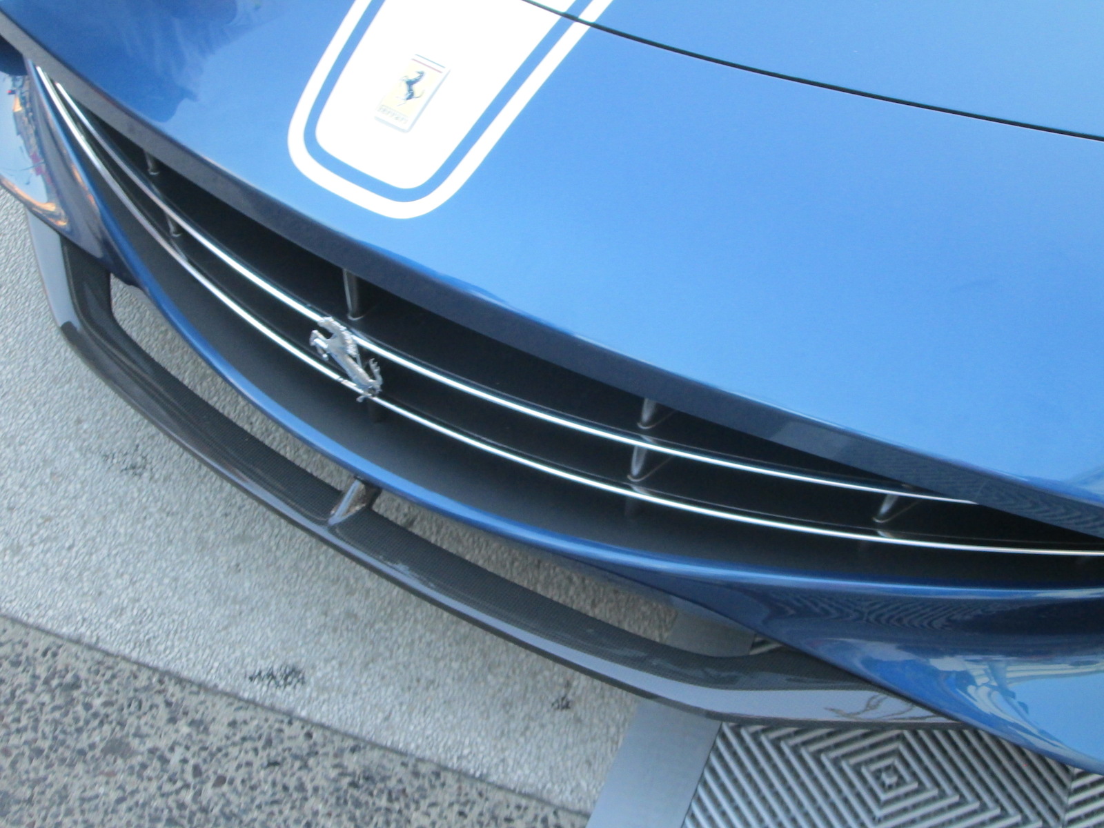
FRONT: The jowl-like front reminds me of those pictures of Col. Stapp riding in the rocket sled decades ago where his mouth was forced open by the wind. The hood vents are very clever, exiting the air out of the side of the depressed vent. The LED-rimmed headlights are par for the course these days but nicely integrated. The outside rear view mirrors stick out like big ears but soon automakers may be able to replace those with TV cameras that pose less of an air drag.
SIDE: Way, way too much sculpturing but the biggest sin is the vertical vent aft of the front wheels looks way too Corvette-like. Do you realize how many Corvettes you could buy for the price of this car?
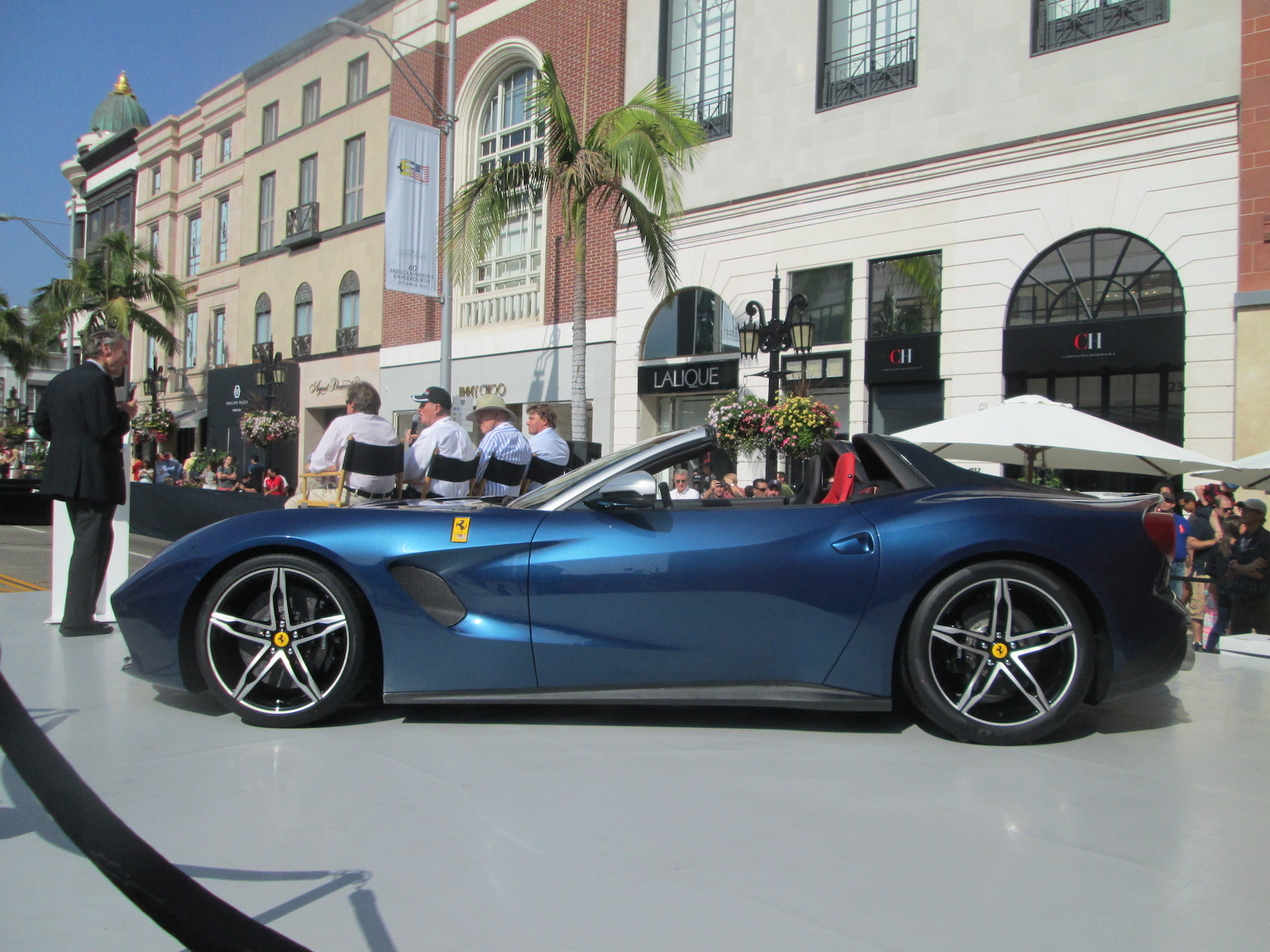
The headrest fairings, with their cut-out portions, are no longer fairings as they were on the one-off NART F12 TRS spyder Ferrari Special Projects built for a private customer a couple of years ago. Those humps were satisfying but these hollowed-out ones look cheap. Aesthetically they are a failure.

REAR: The single taillights on each side continue the more recent traditions, but the upward tilted panel for the license plate is way too obtrusive in my view, showcasing the plate which is after all, only a State-imposed method of identification and not important to the design.
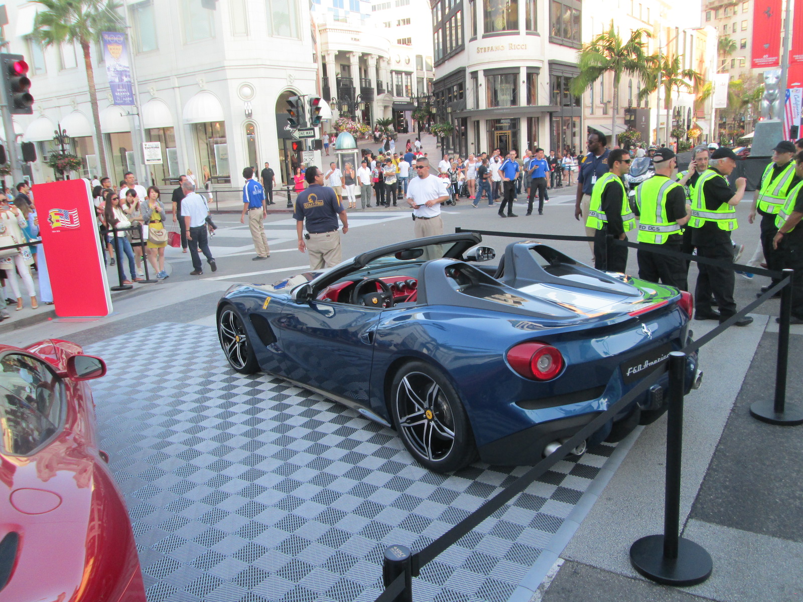
That vertical thing that looks like a cell phone jammed on the back is too attention attracting considering its only occasional use. If it is some sort of emergency brake light, I think it could be integrated into the design and less distracting. All the shrouding around the dual exhausts seems unnecessary and looks plastic-like from a distance.
THE STRIPES: Hey, what can we say, they wanted an all-American theme (the car is only offered in the U.S.) so they had the blue exterior, they got the red seats, now the white stripe. And supposedly the colors are related to the North American Racing Team NART colors, the team that carried the Ferrari flag into battle back in the ’50s and ’60s.
THE INTERIOR: Here’s where they went berserk. They appear to be much too influenced by the rococo designs of Pagani, whose interiors are way too Steampunk for anybody who knows racing cars—bling for the sake of bling y’might say.
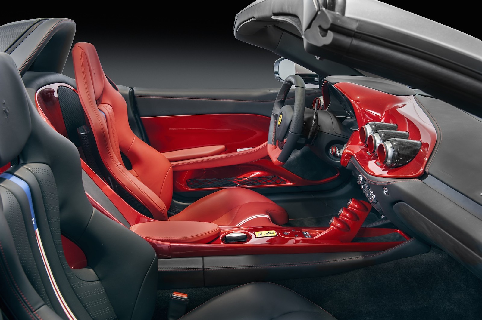
It appeared that the dash was painted translucent red over some alloy. The separate podding of gauges – like those on the console and those on the dash – is something like teenagers do with their rice rockets where there is no dash space for all the aftermarket gauges they want to add. And the color choice of red interior and blue exterior – how could the Italians commit this crime? (I know, I know, the American color theme) when they have been great at harmonizing colors for centuries?
I never thought I’d say the Viper or Corvette interior is better than a Ferrari that cost many times more but the interior we see here is cheap and sleazy looking, like something an adult film star would find matches her dressing (or is it un-dressing) room décor.
IN SUM: the real genius is not in the design of the car but in the marketing of it.
Offering only ten in a country with, what, 330 million residents, you can’t help but sell them all. I am just disappointed to see that so many aesthetic considerations were set aside by those who would consider it a good investment merely because of the fact each one is one of a precious few.
Let us know what you think in the Comments.
All photos by Richard Bartholomew – except the interior shot which is compliments of Ferrari.
THE AUTHOR: Wallace Wyss is the author of the Beyond Barn Finds…The Baroness and The Mercedes: and 49 other Entertaining True Tales From the World of Rare and Exotic Car Collecting.
Sell your classic car on My Car Quest – click here.
![]()
The opinions expressed here are those of the author and not necessarily those of My Car Quest.

Mike, I agree with you 1000%, especially on the interior. Since this is a US designated market car, I am afraid it doesn’t speak much of the aesthetic tastes in this country. If you de badge it and cover up the caricature “afterburner” tail lamps, it may easily pass as a Corvette. However, the interior is its biggest sin. No style, no flow, looks very haphazardly put together, something I could expect from a model kit. My biggest worry is that it could be indicating a new direction for the Ferrari. If. That’s the case, we may be witnessing a demise of a truly iconic marquee…
I think Ferrari could use the services of Giorgetto Giugiaro.