by Wallace Wyss –
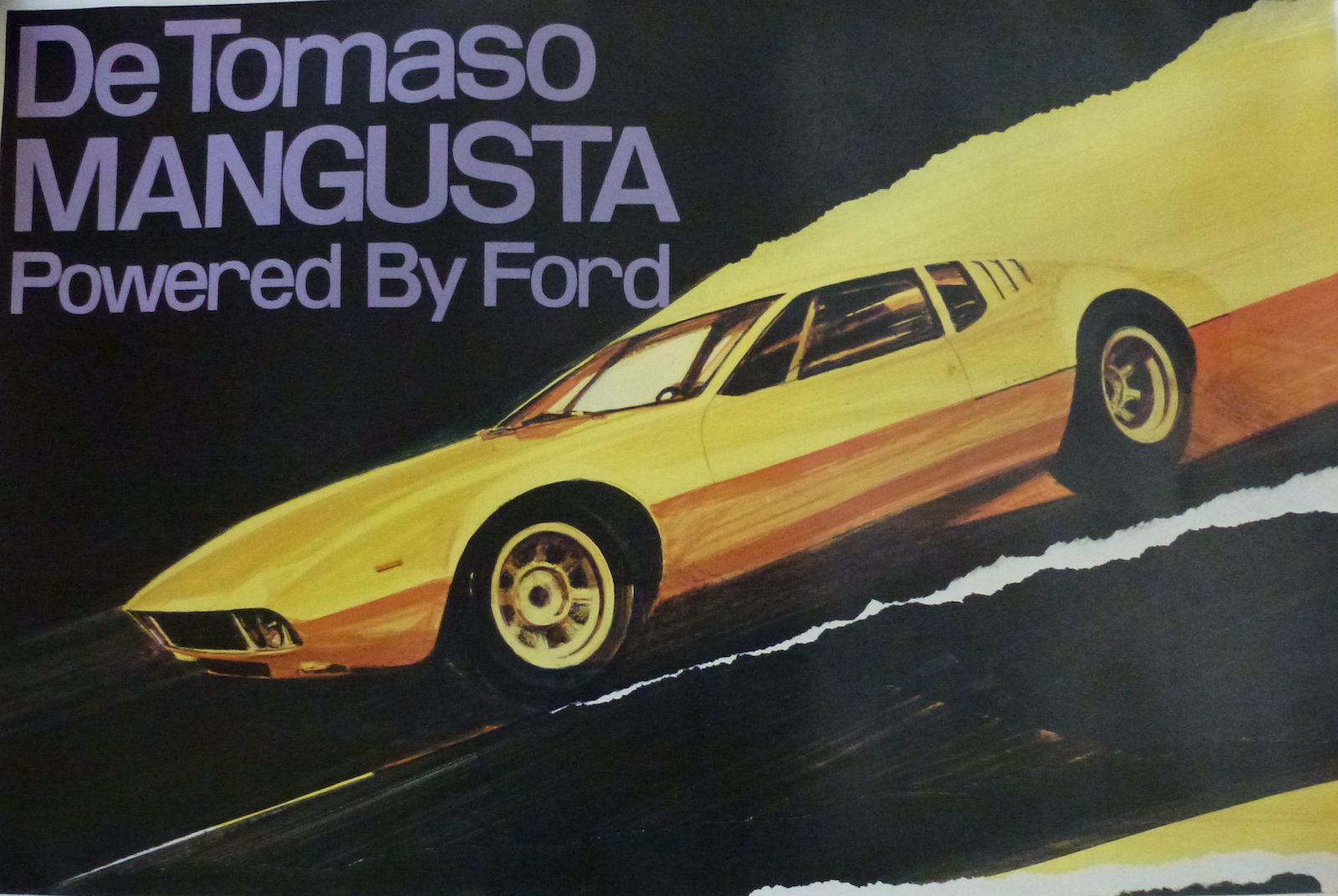
I remember the first time I saw one, in roughly 1968-’69, before the Pantera was announced, in Michigan outside a car museum, in Hickory Corners. The owner was crawling underneath it to adjust the transmission with Allen wrenches. I later learned it was a car not without problems but to me it remains a very inspirational design, one of the few I’ve seen go from artist’s sketch to production with hardly any changes.
THE ORIGIN
Alejandro DeTomaso was an Argentine building cars in Italy, partly supported by his American wife Isabelle (Haskell) who came from a family of entrepreneurs who bankrolled their son in law in buying Ghia Carrozzeria. They were both race drivers and involved with OSCA until DeTomaso wanted to make a mid-engine OSCA and the Maserati brothers said “no” so in ’59 DeTomaso and his wife started their own auto company.
At some point, possibly 1965, DeTomaso started building a spine framed mid-engine race car, the P70, with Carroll Shelby, a car designed by Shelby’s Wunderkind designer Pete Brock. This car, the 70P, would have been a competitor to Can Am cars. Ford was not supporting it though at the same time still employing Shelby to shape up the Ford GT for Le Mans. There’s even a picture of a Mangusta at the Ford Design Center wearing SHELBY grille badges so maybe Shelby’s plan was, if the race car was a success, for Ford to market the Mangusta with his name on it. But if that was his plan, it went awry.
Shelby didn’t keep up with his half of the investment and, in a fit of pique DeTomaso introduced the race car as a DeTomaso car, said it was designed by Ghia and didn’t give Brock credit. But Brock had his drawings to send out to magazines and eventually was recognized as the designer worldwide.
The Mangusta came about when DeTomaso realized his first production car, the Vallelunga, was too small and with four cylinders not respected the same way as a Cobra. He realized how cheap an off the shelf Ford pushrod V8 was and recognized the worth of the ZF transaxle used in the Ford GT. He knew he could build a car that could make profit using Ford’s V8 and ZF’s 5-speed, at $11,000, that time about two thirds the price of a V12 Ferrari. He had hired Giorgetto Giugiaro at Ghia Carrozzeria and tasked him with putting a body design for a road car over the 70P chassis.
At first his name for the Mangusta was “DeTomaso 5000” at a major auto show but, remembering how Shelby had reneged on paying for his half of the P70, DeTomaso named the road car the “Mongoose” explaining to anyone that asked “it is the only animal in nature that could take on a cobra,”.
Here’s my take on the design:
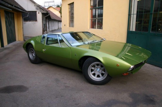
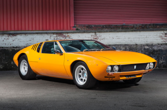
FRONT No bumpers. The bumper laws must not have been created yet. Giugiaro’s original drawings show rectangular headlamps probably CIBIE from France, but Americans are used to the quad round lamps and CIBIEs were not legal in the US. As it was DeTomaso, through some legislator, probably a friend of the Haskells, got an exemption to some 17 vehicle requirements on the basis it was a low volume manufacturer. The biggest mystery on the front is why there were two holes, along the bottom valance panel under the headlamps, maybe for bumpers never mounted? Or for cooling? There was a letterbox slot scoop dropping down from the front undertray to get more air to the radiator.
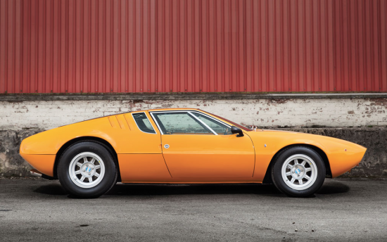
SIDE The car was a pure fastback and the small rear 3/4 window made it more practical than the GT40 as a road car. The car has a dominant crisp edged beltline that divides its side view into two halves. Having its own wheel design helped distinguish it from other sports cars that say wore Borrani wire wheels. The original pale gold prototype had rubber trim on the side windows but for production chrome was added. The original gold prototype also had more dramatic deeper dish wheels.
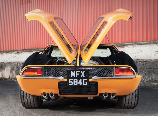
REAR It has been criticized for having Fiat 850 taillamps but the prototype had large taillamps created for it, carrying reversing lights, but looking back, the smaller Fiat lights are better because they make the car look wider. The grate between the taillights was a stroke of genius for cooling but the crowning touch of the back where the engine compartment hot air vents below the rear backlites. By being carved out of a flat surface they complement the design making the body look strong and sculptural.
The split rear window is clumsy, close to the design of doors on an underground tornado shelter in Kansas, but DeTomaso wanted good engine access and gullwing center-hinged doors gave him that. And it looked dramatic when you opened the gullwing engine hatches.
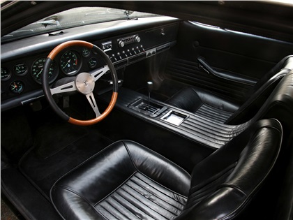
INTERIOR The dashboard was close to the Ghibii, also designed by Giugiaro at Ghia–a row of gauges and toggle switches. The prototype had a non-opening sunroof. The bucket seats were almost on the floor and had short backrests, good only for a short man like DeTomaso but not for 6-ft. tall Americans. If a 6-footer sat at the wheel his forehead was only 2 inches from the windscreen.
IN SUM Though the rear has barely useful bumpers, the car is a seminal design that even sports cars designed 60 years later can’t match for simplicity of design, or maybe they could if they too got exemptions from 17 different laws. It turned out to be too low to the ground (a speed bump can break the transmission case) but if driven with caution it can benefit from the sleek profile. Mechanically it was an oversteerer but reports are that working on tire sizes and spring rates can reduce that.
It had gone into production with only a minimum of testing, typical of a DeTomaso project. He would lose interest fast and go on to the next adventure.
FORD CONSIDERED IT
Eugene Bordinat, the design chief at Ford owned one and thought it would make a good exotic for Ford to import. Henry Ford II was in his “Italian period” then and wanted Ford to have an Italian car in their showrooms. Maybe he was still mad at Ferrari for refusing his buy-out offer of a few years earlier (portrayed in the film Ford v. Ferrari). But after a Ford engineer and a designer went to inspect the Mangusta being built, they decided it was too crude to be mass produced. Ford wanted a car that could be built on an assembly line, with so many coming off the line each hour, not hand built. They got it in the Tom Tjaarda-designed Pantera, which was built at Vignale despite the Ghia badge. The Pantera met their needs but it was not a ground breaking design like the Mangusta.
Let us know what you think in the Comments.
THE AUTHOR: Wallace Wyss is co-host of Autotalk, broadcast from KUCR FM each week in Riverside, CA.



To this day, one of the most beautiful cars ever designed. I’ve always loved it.
Having owned a Mangusta, while still a designer at Ford, I can say that the only shortcoming for me was visibility. If you were changing lanes, you planned ahead! Enough power to keep you excited yet out of trouble.
As designers, we loved the styling and I think it holds up extremely well to this day.
Mr Bordinat also had one and it was customized to his specifications.
Thanks for another great look back!
The Mangusta takes my breath away!…. Still!….. These many years later.
I first saw three of them at a dealer’s showroom in Auburn, MA in 1969. No Ferrari ever hit me like the Mangusta… Nor did the Pantera. I was fixated on the Deep Blue one with lipstick red interior. Woulda, Coulda, Shoulda.
There was a special one built for Amory Haskell Jt. His had blacked out chrome trim and a sunroof. I have never seen a story on it. (Not the car shown in the black and white picture, that’s the prototype)There was a guy near Encinitas CA some years ago that had three Gooses, one of which had a sunroof, I am guessing Amory’s was a prototype. Amory was Isabelle’s brother, He was working for the family firm Rowan which was backing DeTomaso when he got killed in a plane crash while on a nationwide tour to sign up dealers, The private plane hit a gas storage tank in a snowstorm. March 19, 1970
Amory Haskell Jr., 42 years old, who was prominent in New Jersey horse racing and an executive of Rowan Industries,
John Ellis, 47, of Middletown, chairman of the board and president of Rowan Industries, was also killed.
BEAUTIFUL, CONCEPT, CAR. TURNED OUT TO BE 20% TO SMALL ALL OVER. COULD NOT HANDLE AT ALL. OVER STEERED IN FRONT AND UNDER STEERED I REAR. MOST ALL WERE CRASHED IN THE FIRST YEAR OF OWNERSHIP. NEVER DID WELL IN ANY RACES, BECAUSE EVEN THE PROFESSIONALS COULD NOT SORT IT OUT. OTHER THAT THOSE FEW ISSUES, GREAT CAR IF YOUR WERE UNDER 5 FOOT TALL, AND DIDN’T TRY TO REALLY DRIVE IT.
I am 6 foot tall and owned one of four RHD ones sold new in Australia and my forehead almost touched the windscreen and back of my head nearly touched the rear screen . When it rained the wipers never worked , so I always carried a potato , when it got hot the air con failed along with the electric windows . When the windows worked , they only went down about half way . In a straight line it was a rocket with its replacement Ford 351 ( 5.8 litres ) , but it oversteered like crazy and sometimes the rear end had a mind of its own . However it was pure magic to look at and whilst stopped at lights you could see people mouthing Ferrari . It was I think white when new , but when I owned it Ferrari red . There must have been a bit of Australian in the design next to the engine because there was a slot that perfectly held an Aussie 24 carton of beer . Sold it for A$18900 late 70’s with no spacesaver spare wheel .
I lost you on the potato being used in place of wipers, The late Herb Grasse, Bricklin designer, owned two different Mangustas when he was working in Australia for Ford. Herb was an eccentric guy, maybe you have some good stories of what he did with his gooses. I gather he was too flamboyant for Dearborn so that’s why they sent him down there with the wombats and wallabies….
Wallace , I learned the potato deal with my first car a 1250 MG TF whose wipers rarely worked . An old mechanic told me to cut a potato in half and wipe it over the entire screen and when it rains you just drive a little faster and the rain bounces off . Try it and it really works , well at least better than no wipers . I think the Italians may have got some electrical lessons from Lucas the English Prince of Darkness . I remember Herb Grasse had something to do with the design of the XD Ford Falcon in the late 70’s , the first Australian car with a plastic fuel tank and almost a 4 door clone of Fiat’s 2 door 130 Coupe . No idea what he did with his Gooses , but maybe mine was one of his exes . Maybe if he worked with Ford he was responsible for the replacement 351 donk ..
Woke up at 4:00am, read this article and then went out to unlock the cars bedroom “vault” doors. Yes, I should be planning for another hurricane and be tense and worried. But when I focused at and rubbed my hand over my Mangustas beautiful rear end, ALL MY PROBLEMS MELTED AWAY! Yes most rear ends will do that to me and to you but this is a CAR who is organic and natural. I would have taken it out for a 4:30am drive in pajamas but I must get ready for bad weather. The only view of her that is not in perfect harmony is the large front spoiler but the black leatherette covered front hood nose and uniqueness offset that look. At 3,400 miles I gave her her first alignment, using Dick Ruzzin’s numbers, took about 4 hours due to the horrible one that was given during its factory birth. All we could think about was that the deTomaso factory alignment person was cross eyed, had Tourettes and rode a bent motorcycle. That alignment changed the car from irrational handling to being DEAD spot on! She was born with Michelin XWX tires. She now corners like a cat on Velcro and no Porsche 911 nonsense from the fine rear end! Such a joy to sit in, drive and look at. A real treasure.
I am fighting the urge to jump up, go out into the shop, and see if the ingredient list on the bottle of Rain-X includes potatos.
I seem to remember Bordinat having one like that? I wonder if he got the idea from the GTC/4 a 1971 Pininfarina design. Maybe Bordinat’s family could confirm it…I don’t remember the bottom half being black. oh well steal from the Boxer too…
My above red car was E Bordinat’s car, I am third owner. Bordinat’s family was not much help in my gathering of all deTomas Mangusta facts. Tom Tjarrda, many Detroit Ford retired workers and Robert Cumberford were the biggest help. GTC copy or not, my covered front metal was done in fall of 69 + -. This photo was of its second color and was displayed on the rotiserant in the back patio of the Ford Design Center so the designers could view the cars design from all angles. All Ford cars after 69 were changed to fast backs instead of notchbacks. This photo was most likely taken in 70 according to Randy Cox and others who worked for Bordinat. It was pianted about 6 times in diff colors so to see what color/shape were best.
I liked the fact if wasn’t only Bill Mitchell and Chuck Jordan among Detroit design execs who bought snazzy furrin’ cars to drive around. it gave the stylists more chance to see what wasn’t readily available in Detroit. But i wonder if a few levels below Bordinat you’d be fired for driving to work in an expensive foreign car?
This design critique is a sham.
It considers none of the criteria that designers use in trhe creation of a car design, or does it judge the quality of their use in the creation of the Mangusta. This is a design COMMENTARY by someone who likes to make automotive comedy out of the hard work by others who actually did it, like deTomaso. He is NOT an expert on the car, his writing technique is to gather writing by others, hope it is correct and then put the pieces together in a new format to revise history.
Is that not right Wally?
Wally Weise has never made an effort to understand design and it shows in this article. There is a great deal of mis-information in this article by WW. The wheels are a great example. His critical approach is always negative as he does not repeat those who can do what he cannot.
The Mangusta design had a profound influence on global automotive design, totally, totally missed by the author. Do not be mis-led by someone who is a declared amateur.
It would be great fun to debate Wally Wysse about any kind of design, automotive or otherwise.
The only published and authoritative design book about the De Tomaso Mangusta is BELLA MANGUSTA, The Italian Art and Design of the De Tomaso Mangusta, by an experienced international car designer who has known the car for over fifty years as well as the designer, Georgetto Giugiaro.
DICK RUZZIN
Mr. Ruzzin,
Thank you for your comment. However, it is a little harsh without any details.
Can you share you specific complaints?
Mike,
He can write an article if he wants, but say what it is. A COMMENTARY, not a DESIGN CRITIQUE.
First of all this is not the first article that I have read by WW where he portrays that he has expertise and knowledge that he does not have.
He uses the work of others, without verifying it and passes it on to be considered as his own.
Wally Weise does not understand design and it shows in this article. There is a great deal of mis-information in this article by WW. The wheels are a great example, they were Italian racing aftermarket in many sizes, rim widths and offsets.. His critical approach is always negative as he does not respect those who can do what he cannot.
So,
He calls this a design critique, yet nothing about:
PROPORTION, FORM LANGUAGE, GRAPHICS, HARMONY, CHARACTER, ARCHITECTURE, FUNCTIONALITY, AERODYNAMICS, ERGONOMICS, ENGINE ACCESSABILITY, or DESIGN. Therefore anyone reading this article comes away thinking that he has defined it and that desifgn is a pretty confusing subject with no intelluctual basis, that is not so.
He writes as an authority so his words, by those who do not know, are considered truth. This misleads peope and literally changes history, for the worst, adding confusion and disharmony to that which is true..
He is critical and envious of the Automobile Design Profession, often making fun of it, here again in this article.
I am reading Dick’s comments three years later, First of all he should learn to spell my name.
Secondly as an automotive historian I have freedom of expression to portray history as I see it. I also think the readers would like to read an analysis by a pro designer–go for it.
WW
I wrote a book about it.
BELLA MANGUSTA, the Italian art and design of the De Tomaso Mangusta.
As an automotive historian, you clearly are not educated or experienced in the art of automotive design. You have demonstrated that several times that I have seen. I would be happy to debate the point with you at any time.
Maybe Michael can put something together for the site, where we each would do a design analysis for whatever car that you would like.
That would be fun.
.
IT IS MY OPINION, THAT THE MONGUSTA WAS A BEAUTIL DESIGN SHAPE, BUT WAS 20 % UNDERSIZED FOR FIT THE AVERAGE AMERICAN IN. AND IT HAD SOME OF THE WORST HANDELING OF ANY CAR EVER MADE.
Skip, yes it was designed for a 5’8” or so person. Have you ever driven one and if so did it have an alignment and proper tires? Maybe you’ve read too many pessimistic reviews from self professed boy racers. These ill handling Mangusta stories since 1969 are like a TDS moment. Once a proper alignment is done, BECAUSE the factory did not know how to, and top line tires are used it has phenomenal handling. Six years ago my friend in his Jag XKE and I did a non sissy big boy race thru the twisting roads of deep Louisiana back woods at average speeds of 80 up to 115 for about 110 miles and I had no problem leaving him behind. It held line perfectly, too many racer types don’t use their brains/skills when flying on asphalt. Yes its rear end decreasing radius turns limits are not linear. So be it, beautiful ladies are also difficult to figure out. But both are worth the ear to ear smile-ride.
You lost me on the “:ear to ear:” but I think there are many similarities between the way a beautifuoal car seduces you and a beautiful lady turns on her charms. I remember meeting a Russian model (blonde, sbout 5;6:) explaining models are taught to walk swaying their hips exacrly 3″ from side to side. I have a lady friend who fell and hurt her hips=so now she walks without any movement down there , losing one if the key moves women use to attract a man