by Wallace Wyss –
Say it isn’t so, Joe…from some angles the new $100,000 plus Mercedes SL roadster looks like…a Porsche. I heard about it on the radio, a rival car show, and had to check it out.
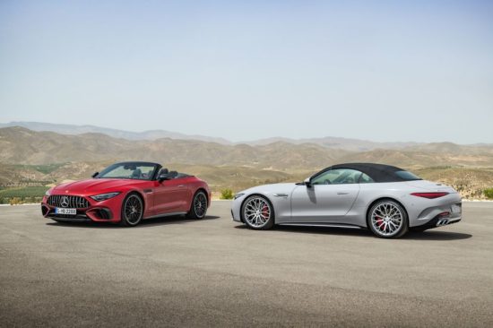
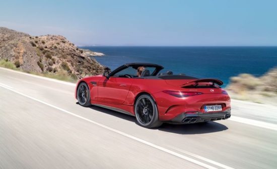
When I saw the first rear 3/4 view, I thought how could this be–it’s so Porsche like? When the Porsche Cabriolet is rear-engined and the Mercedes SL is front engine. But it all has to do with a gradual refining of the lines of the previous SL.
They tapered the rear down and the result is kinda Porsche-ish. Wiegehts Stuttgart!
Here’s my visual reaction:
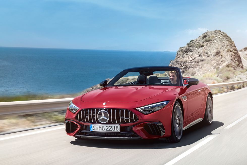
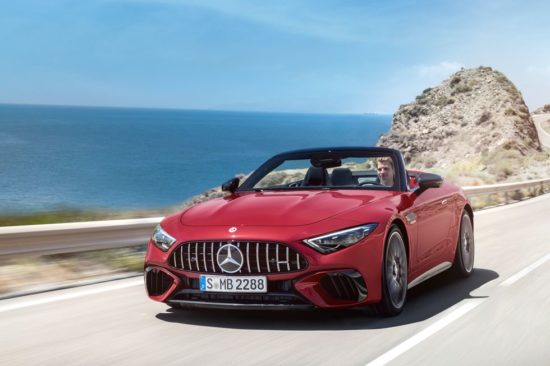
FRONT Ah, that old ’52 Mercedes SL “toothy” grille with no chrome surround. I think their harkening back to a design from 70 plus years ago is a stretch–would rather have that grille they had on recent models with the many tiny points of light like stars in a dark sky. The headlights as per most cars are still slanted but don’t know if that’s a design trend getting old.
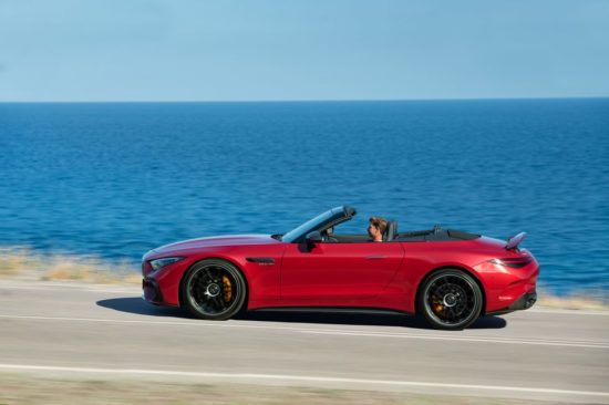
SIDE From the doors forward it is Mercedes. Plenty of hood length for a V8. But from the doors back it begins to taper and when the top is up, looks Porsche-ish. Engine hot air vent looks smaller than some Mercedes SL models of the fast, almost Aston Martin inspired.
REAR And both marques have horizontal shaped tail lights though the Mercedes ones take am un-needed dip in the center. The spoiler is activated in the shot we saw but don’t know if it reclines flush or flat when not in need. All that lower section below the bumper starts to look like black clutter, maybe more body color down there is needed and a little chrome. This is not a LeMans racer where the clutter–vents and exhausts–is all functional, still gentleman’s car, nicht wahr?
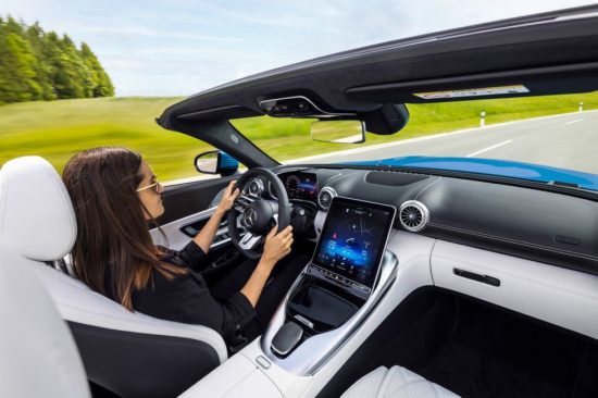
INTERIOR Huge screen–will it wash out in the sunlight? Good duotone matching (like Bentley). Rear seats are present but surely not for adults on a long trip.
IN SUM It is good for the marque to always have an SL because the early SL’s (racing ones as early as ’52) let the world know the Mercedes after the war was still going to have a sports car. I hope there’s an alternate grille and the tail light shape needs a rethink. In sum, an expensive looking luxury car but we wonder what Porsche’s designers think?
Let us know what you think in the Comments.
THE AUTHOR: Wallace Wyss has been a guest lecturer at the Art Center College of Design.
Photos compliments of Mercedes.



I agree with the design assessment. Definitely too Porsche-like at the rear and the grill you describe would be nicer. The big news here IMO is that this SL has rear seats as an integral part of the design, small as they may be. All prior SL Mercedes were strictly two seaters, with an option (though rare) where an owner could order a rear jump seat on the Pagoda SL’s (230, 250 and 280) and on the R107 SL models (350, 450, 380 and 560). So, the 2022 SL is an end of an era of just two seater SL models, so this is some big news.
Or, its butt looks Aston Martinish!!! Glenn in Brooklyn, NY.
I DON’T LIKE THAT GRILL ON THE MB. WAY TOO BIG AND CLUNKY.
Why is it the designer drawings always look so much better than the car? And they are always making the windshield so chopped in the two seater drawings. In this one, the rear fender– from side vie– is more shapely (and more Porsche-ish) than the final design…