From deep in the My Car Quest Wayback Machine comes this design analysis from October 2014 of one of my favorite cars, the Iso Grifo. The author, Raffi Minasian, is a widely published automobile designer, illustrator, writer, historian, and Pebble Beach Concours d’Elegance Class Winner.
The blue Iso Grifo used for this analysis was my second Iso Grifo (the first one was red). I have published many articles about the Iso Grifo including this brief history used in the Concorso Italiano program in 2015.
Mike Gulett, Editor
by Raffi Minasian
Car design is an amazing combination of art, sculpture, passion, and engineering. A fortunate few are able to claim one or two cars as production pieces. Fewer still can boast a career with more than 5 or 6 cars to their name.
Giorgetto Giugiaro
And then there is Giorgetto Giugiaro. Masterful not only by virtue of his craft, his conceptual reach covers decade after decade with dozens of brilliant results both in production and concept genres. Beginning his career at Bertone (1960-1965) and then advancing to Ghia (1966-1968) before starting his own firm, Giugiaro designed many of the most important sports cars before the age of 30.
It is impossible to overstate the magnitude of Giugiaro’s contributions to the past 50 years of automobiles. Giugiaro was, in the world of car design, as prolific with “hits” as The Beatles were with their music. After all, what would you expect from someone who was voted “Car Designer of the Century”.
My perspective on the Iso Grifo design
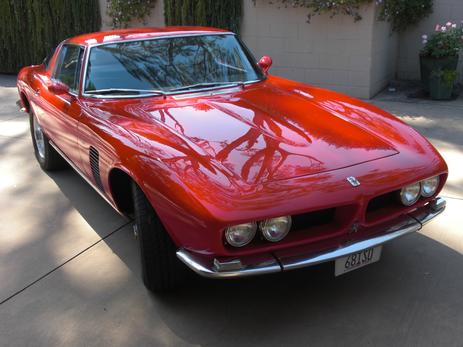
Giugiaro penned the Iso Grifo in 1963. Iso cars were just beginning to establish a unique place among Italian marques when Bertone was consulted to participate in this new offering. With a chassis designed by Bizzarrini, disc brakes (inboard at the rear), tube frame chassis, de Dion rear axle, and coil springs all around, performance was a given. Sporting a height of just under 48” with a fully unitized steel body and lightweight aluminum hood, the final result was a road car with great Italian style and (with the venerable Chevrolet V8) reliable American performance.
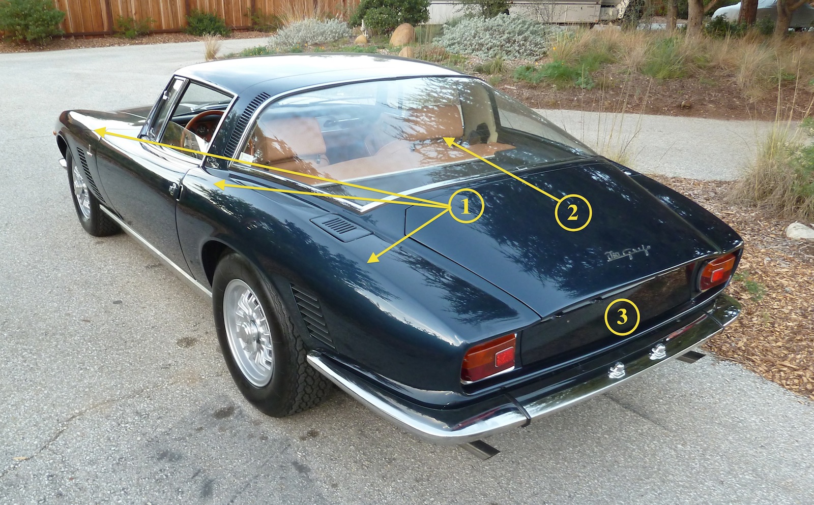
1. Gorgeous blade edge transverses the entire side section of the car, pulling the fender line outward in a dramatic way while also widening the stance of the car.
2. Enormous backlight covers a large portion of the rear of the car but dramatically lightens the body scale in this area. Superb use of glass as an overall part of the design.
3. Kamm back tail is a departure from the former tapered tail sections of many touring cars and harkens to the race car heritage.
Designed well before the Maserati Ghibli and Ghia 450SS (both of which were also Giugiaro designs), the Grifo was a clear departure from the earlier voluptuous fender work of the 1950s. Emerging profiles were now lower, leaner, and more forceful. Giugiaro had already begun experimenting with long hood and fastback rear designs as seen in the Testudo. He had witnessed the all-new XK-E and Corvette racer that would inspire the new Sting Ray and felt these forms were important movements in the coming design trends. The Bertone take on this “look” was to pull the fastback line quickly to an angled tail section that visually pushed the car forward.
The long hood and short deck
The Grifo would become a clear and fresh statement of the long hood and short deck designs as sports cars exited the rounded fenders of the previous decade and entered gradually into the folded paper era. The most notable of the Grifo bodylines were the crisp and bladed fender edges that defined the front fender line as it creased over the wheels and continued along the entire profile of the car. This slowly undulating line allowed the upper canopy of the Grifo to sit low along the edge while gently draping over the front and rear wheels. Tailored wheel arches and delightfully fine vents accented the body and served cooling functions derived from race cars. Throughout the design, nothing is swollen or protracted. All surfaces are taut and firm, yet maintain a muscular fullness that defies the scale of the car.
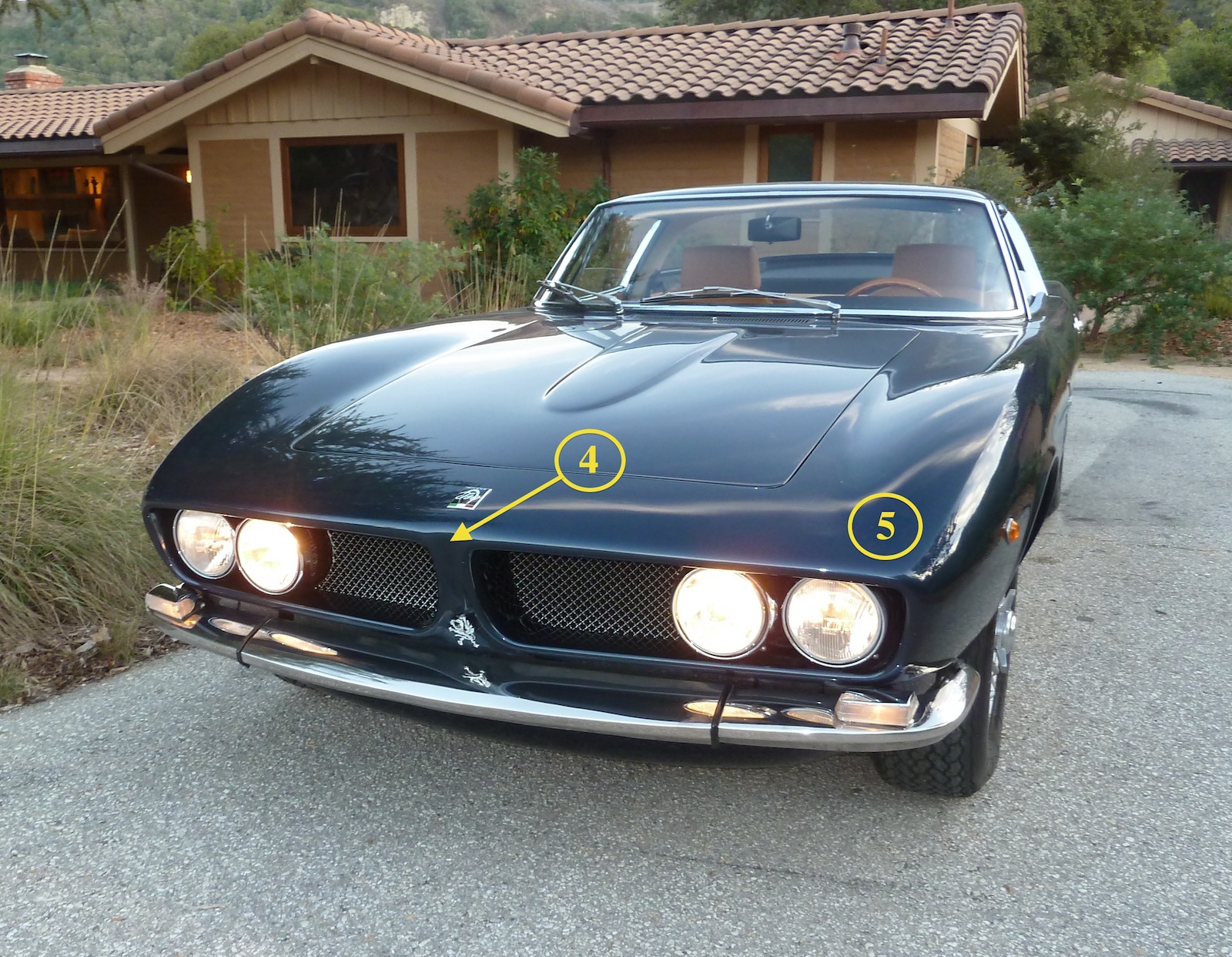
4. Front of the car is tall considering the low overall height. No hidden headlamps here. Split grille is unique but has distinct American “feel” to it, the only visual hint that this car is hiding an American drive train.
5. Gentle tapering of the sides of the car come to a softened corner, making the frontal architecture dramatic and crisp, yet elegant.
A true GT car
Because the Grifo was to be a true GT car, it was critical that it sported a sizable trunk for luggage. This allowed the design to have a full and sweeping rear overhang and lengthy deck lid, yet created a very large rear presence. To reduce the visual mass of the rear and create a visually lighter upper, a huge wraparound back light (the rear glass) was designed. This enormous visual vacancy follows the line of the graceful arch accelerating from the windshield header all the way back to the gently recessed Kamm back tail. Unlike the signature Ferrari rounded lights, delicate rectangular taillights tailored the rear section with definitive termination at each corner. At the front of the car, a split grille delivers a wide open mouth with quad headlights – a visual hint to the American powertrain lurking inside.
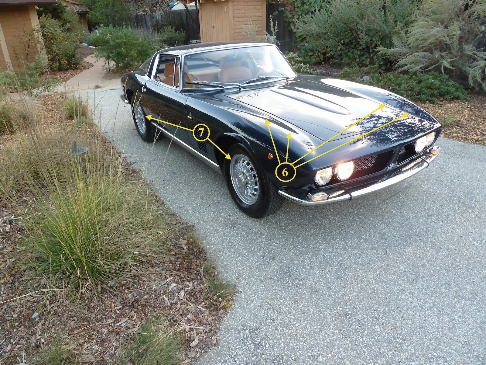
6. Although not utilizing typical rounded fender projections, the front fenders feature a subtle swelling which is beautifully controlled from front to cowl in a smooth arch, visually minimizing the massive catwalk and flat hood.
7. Cast magnesium wheels are distinct and reveal a modern interpretation of the former wire wheel design of earlier cars.
Iso Grifo – sensuous curvature with rectilinear lines
What is all the more surprising about the Grifo is how much of the car combines sensuous curvature with rectilinear lines. Throughout the design, there are corners and edges, crisp architecture that would come to define the 1970s folded paper look, but softened with a delicate sensitivity echoing the traditions of race cars and sculpted fender forms.
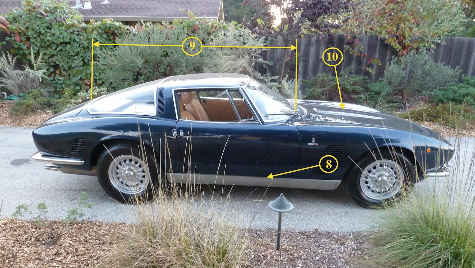
8. Stainless steel rocker panel is a brilliant attempt to trim down the otherwise thick side section. This visually makes the car appear more lithe in profile and reminds us visually of side pipes and Iso racing heritage.
9. Vast greenhouse is visually minimized through the use of curved glass and thin A post. C post is wide and full, both homage to the original concept which had a stainless targa band and again, honoring the race heritage with roll bar design.
10. Subtle hood bulge hints at front engine design but there are no hood scoops, openings, or venting to disrupt the otherwise smooth upper surfaces.
The Grifo remains today one of the most stunning GT cars ever designed. A true masterpiece by any evaluation yet also a turning point in design, transitioning the post war Italian traditions of rounded, upright fender expressions toward a lower, wider, shape -combining linear tension and fluid expression captured in a visually lithe and elegant design.
Let us know what you think in the Comments.
About the Author
Raffi Minasian is a widely published automobile designer, illustrator, writer, historian, and Pebble Beach Concours d’Elegance Class Winner. His impressive twenty plus year career includes aircraft interior design for Boeing, toys for Mattel and McDonald’s, consumer products for Honeywell, Polaris, and Rainbird, and car designs for Toyota, Subaru, Moal Coachbuilders and The Franklin Mint. Raffi’s automotive work has been featured on “World of Wheels”, “Speed Vision Network”, TLC “Rides”, and the “Fine Living Network”. Raffi has achieved the “Award of Excellence” from Car Styling magazine and was part of the design/build team for the 2005 Americas Most Beautiful Roadster “Sedeuced”, and published the first Ferrari Hybrid concept in 2008. He has authored articles for Autoweek, High Performance Mopar, and The Diecast Magazine, and his designs have been featured in Car Styling, Forza, and Automobile magazine.
A pioneer professor in the California College of the Arts DMBA program Raffi teaches industrial design and innovation and is a noted speaker at museums and corporate events on design, innovation, and creative process.
Raffi devotes much of his professional energy to educational programs for young people interested in careers in the arts, music, and humanities, including his recent appointment as Chairman of the Board of Zoo Labs – an Oakland, CA organization committed to finding fresh ways of supporting creative careers.
Raffi lives on the West Coast with his wife and two daughters where he maintains a modest collection of full sized cars and an obsessive collection of model cars.
Raffi has written for My Car Quest before about his achievement of designing and building his own custom car.
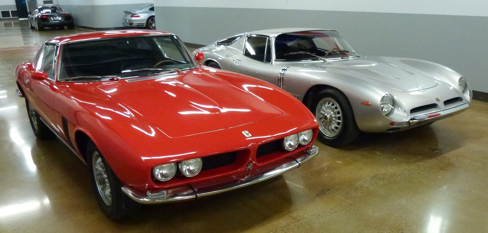
Mike Gulett’s red Iso Grifo
All photos by Mike Gulett.

One of the best pieces I’ve seen on My Car Quest and the best design analysis I’ve seen anywhere. Thanks Raffi and Mike!
This is a really excellent piece. More articles from this author, please.
Thank you. I hope to do more for My Car Quest in the coming months.
As a design critic myself, I enjoyed this article. But it is a bit misleading in that the pictures are shot with some lens (38mm?) that flatten the car out and made it look wider, better than it does in person. It’s actual proportions are taller and narrower, so naturally it looks as modern as if it was designed yesterday.
Also I have two questions: What does Raffi think of how dated “the open headlight Grifo became once the long nose made its debut, does he look at it and think “too bad about those headlights?”
Also on the one with the Ford engine, it has this big hood scoop I call the ‘wedding cake hood” though others have likened it to some architect’s model of an office building that was left on the hood. What does he feel about how that scoop hurts the design overall or helps it, and should they just have gone to a lower intake manifold and remote air cleaner?
wallace,
These photos were taken using a Panasonic Lumix HD camera with a 25 mm Leica lens.
I know when I like a car design and when I don’t like a car design.
However, because I am not a trained designer I cannot objectively explain very well why I like one car and not another any more than I can explain why I like one bottle of wine and not another. The wine either tastes good or not good to me.
I really appreciate when a designer like Raffi Minasian is able to explain the features of a car design that attracts us to like it or to not like it. I think the like or dislike of a car design is subjective like our love or not love of a particular piece of art but it helps to have someone point out the design features and explain what the designer was trying to achieve. For this it takes someone with design expertise.
This is why I asked Raffi to analyze one of the great car designs of the 20th century – the Iso Grifo.
Even though I have been a lover of the Iso Grifo for many years and the example used here is the second one I have owned I still learned many things from Raffi’s analysis.
Thanks Mike – it’s a pleasure to share the passion we all have for beautiful cars. And thank you as well @brandes elitch.
@wallance wyss – the photos were not taken by me but yes, you are correct that the lens does “cheat” the visual corners of the form and pulls at it to cause some favorable distortion. However, the effect of the design in person, remains dramatic, only slightly lesser so in person.
The open headlight version of the car is (to me) more honest to the original car design. The longer nose drops off in a rather fast, almost blunt way, which does not match the overall character of the rest of the car. I do like both iterations, but the open nose with the quad headlights speaks the original design language with clear conceptual continuity. I don’t mind hidden headlights, but headlights are an important part of the visual signature in the face of cars – a feature to celebrate. Indeed in recent years we see more cars with exposed headlights than hidden ones.
Ah yes, the “parking garage” hood of the 7 litre. Well what can you say. In one respect this feature is the conversation stopper regarding the engine. Like it or not, this is the BIG BOY. One has to wonder…was it done with such enormity and so lavishly against the rest of the form purposefully to state without doubt THIS is the big engine?
Of course these cars are of such value today that we accept the visual result, intended or not as a component of value – pretty or not, but I do believe it could have been done with a bit more sensitivity to the original shapes on the hood of the car.
As a Grifo owner for 30 years and an avid student of the Iso marque for even longer, I enjoyed very much this design analysis by Raffi Minassian. One small thing I take issue with comes early in the article, namely “tube frame chassis” which is simply not the case, the car being of steel unitary construction, of course.
I’ve always been struck by the close styling similarities with the Lamborghini Miura. The wheelarch treatment is almost identical, as is the general shape of the front and rear wings. The windscreen shapes are similar as are the way the top surfaces of the front doors wrap around the bottom corners of the screen, though it’s more pronounced in the Grifo. No one will ever convince me that Giugiaro did not have a hand in designing the Miura…
I was glad to read Raffi’s positive take on the 7 Litre hood treatment. To my mind, the one slight disappointment about the styling of the original Grifo is the hood. That rather weedy little “power bulge” serves no practical purpose, like it does on the Jaguar E-Type, for instance. It’s not needed to clear the engine or carbs, though It does help break up an otherwise rather large flat panel, but I can’t help feeling Giugiaro could have come up with something a little more interesting. The 7-Litre’s “pagoda” is certainly that, and is actually quite satisfying with its subtleties, if studied closely. Of course, something of the sort was needed to clear the triple carb setup with its high-rise manifold fitted to the prototype 7 Litre Grifo. It’s a great view from the driver’s seat, too! On some of the last Ford cars it started to become more extreme in height, with 4 instead of 3 louvres and the top panel raised and looking less integrated with the whole. “Butch” is the word I’ve always used!
In looking at the rear 3/4 view, it reminds me of so many other fastbacks–C-pillar is too thin looking. to make it into modern times. The hood hump is too small and too narrow to accommodate three two barrel carbs so is just decorative.
The big rectangular box on the second gen pagoda looks like “Will the architect who left his model of the new office building on the hood of my car please pick it up?