And why it’s needed…
by Wallace Wyss –
OK the new Corvette is, admittedly, a tour de force. After 60 yrs of promising it they finally went mid-engine. Now they have a world class car to combat the European claims of superior handling, speed, etc. Except the New Normal is that you can’t rest on your laurels. Detroit did that with the electric car when the Tesla was just a twinkle in Elon Musk’s eyes. Now Tesla is worth more than GM, Ford and Chrysler combined.
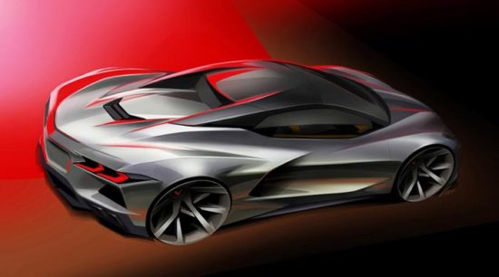
So let’s talk about the new generation. Wait a minute, I hear some of you asking-weren’t you the same guy that praised the styling back in 2019? Yes, but now that I’ve seen them in person I think it’s time to re-do the exterior.
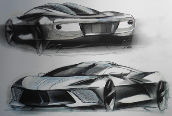
This drawing is based on one of the manufacturer’s press release drawings. I added a double bubble roof and double bubble rear window plus small round taillights. I didn’t get the mesh right on the front air intakes but all I’m asking is for the screens not to look cheap.
THE WIND TUNNEL SHAPED CAR
Oh, they talk about the wind tunnel and GM does have a big one, but when I saw videos of them testing the 2020 clay model it was only putting a stream of smoke on the surface to see how much the wind hugs the body. I’m talking bout building a wind tunnel with 200-mph capability. And the cladding of a Corvette clay with soft clay on the first couple inches so it’s pushed around, in essence shaped by the wind.
But when I suggested that to a designer with 32 years at GM he said that isn’t possible, that if you did it you’d end up with a teardrop shape. Yup cars should actually be shaped like teardrops. But I still say the shape, while originally pure, is compromised by too many gadgetry things, as if various designers wanted it to have Joe’s taillight or Fred’s side vent.
THE SWOOP REAR WINDOW
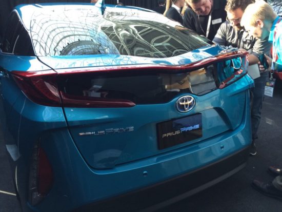
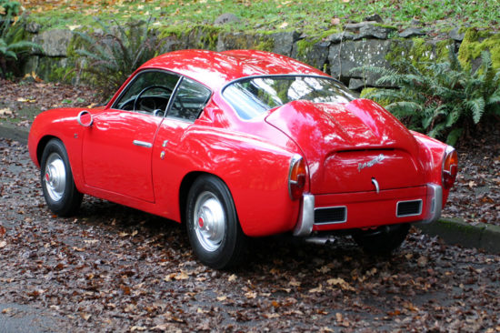
Let me give you an example. I recently tested a Prius Prime and didn’t notice until afterward it had a “double bubble” rear window. Apparently in testing they found depressing the middle of the rear backlite resulted in better aerodynamics. Similar to the “double bubble” roof of the Abarth Zagato of the 1950’s did with the roof and rear deck. Instead they’ve got a rear window on the coupe that looks like a salute to art deco, the odd shape adding nothing useful.
Another goal ought be be to get rid of that tail spoiler that looks like a coupla 2 x 4s. The spoiler needs to be molded into the general shape, not added on.
Now on the front, the grille work in front and back should look like metal. I’m talking about the cheezy cheap looking grille below the headlights and in the tail on each side below the taillamps. Why would they put grates that look like the tray that restaurants store cups in? They don’t need to be real metal but at least look like metal like the grille of the Lexus LC500.
The taillamps themselves need to be deep-sixed if only because they are too much like what you expect in a Camaro. I suggest small circular taillamps placed far out at the ends, similar in shape to ’60s Porsche 906 or Ferrari P3/4 but LED for better light output.
The side vent has a removable leading edge that ought to be available in body color (if it isn’t already) brushed stainless steel or chrome.
In sum, fans of European supercars will like the mechanical part and general shape but in present form, it’s not world class in surface detail. We can fix that, in three years time.
Let us know what you think in the Comments.
THE AUTHOR: Wallace Wyss is the author of 18 books, three on the Corvette. His fine art prints are available by mail. Write malibucrart@gmail.com




I’ve finally seen two C8s on the roads “in situ” and must say they’re an odd mix of exciting and generic. Exciting because I’ve read how good they are to drive. As you point out, the Honda Civic-esque small grills look cheap and inappropriate on a supercar. The styling needs to be refined to make it distinctive, more Corvette-like, and less cheap looking. I’m sure it will come in time because GM has a long history of excellent styling. I suspect this car was rushed to market with too much design-by-committee. Along with future alternate drivetrain offerings, I’m optimistic this car’s styling will evolve nicely.
As a retired GM Designer, I am proud of the team that generated a significant breakthrough design for the Corvette. Over the years the marketing people always came back to the fact that Corvette buyers just wanted more of the same. It took a lot to cause GM to develop a whole new platform for a limited production car.
I do agree they should not rest on their laurels as although it is a stunning design statement it is still very much in today’s design language. If I know GM Design they are probably already working on the next gen Corvette.
The front looks like the team was half way through the design, took a break and forgot to come back to finish. The side scoop slash looks like someone spilled ink on the velum and forgot to erase it and the rear looks like everyone put a idea on for a select down and they decided to just leave it alone.
Some of the early design theme sketches are fantastic but the resulting surface development is abominable
I agree with the detractors: The C-8 is a hodge-podge of surface details all rolled into one (as if a group of high schoolers sat around the lunch table and chose the items they liked best!). It is not a cohesive design…
The original Stingray, while having some questionable fake vents, etc., was a very pure design. We haven’t had a Corvette as significant since (although the Mako Shark in its original guise would have been great).
I disagree with the GM designer. Yes, the Vette is a great car, technically, as they have been for decades. But from a design point of view — as well as quality — Vettes have really been lacking. I propose GM create a new division: Corvette. In that form, there could be an entry-level Vette, the bread and butter Vette, and some limited-run cars. Get it out of Chevy where the mass-production mentality creates cheap-looking (and feeling) cars. Get the quality up.
This fixed it imho. Video at youtube
https://www.youtube.com/watch?v=hi-LG6ofLK8
OK on the side but that front view reminds me of a choo-choo from the ’50s which I remember from the days of steam like Raymond Loewy’s designs for PRR such as the Streamlined K4s #3768.