Sometimes a great concept design (or the designer) is an unsung hero…
by Wallace Wyss –
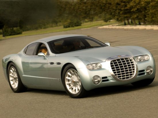
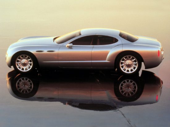
Every once in a while an automaker builds a show car that captures the DNA so to speak of the brand, or a particular model that “made their name” in the past. I wish I could say the Chronos show car of 1998 did that but even though it had a lot of design cues from the old Chrysler “letter series” 300 models and various Ghia built show cars of the 1950s, it is almost forgotten.
What the Chronos did good on was integrating some of the design themes of the past with the layout of present day cars of that time. And it has V-10. Not V8.
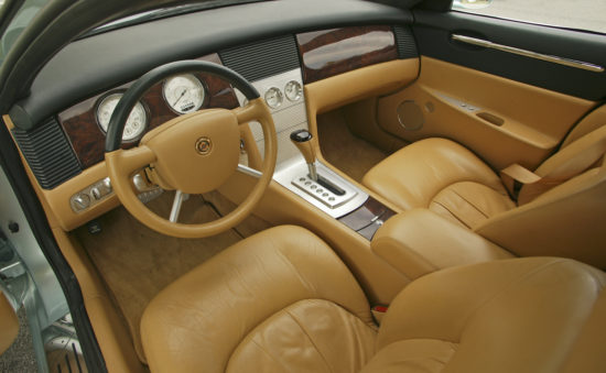
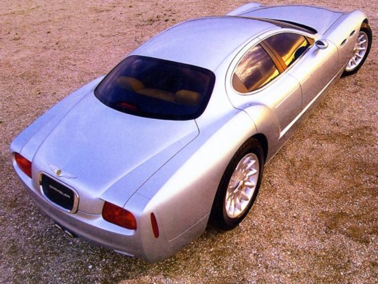
The interior was tres elegant, with lots of gauges set in engine turned aluminum instead of those damn touch screens with simulated gauges you see today. One thing I would find annoying is the custom car thing of no outside door handles, (if you have the a key fob that helps). One road tester who drove it said the interior is quite small, but that’s what you get when you have that miles-long bonnet. It still could have had rear sear room but they sacrificed that for a long tail that’s bland to boot.
Paint choice in a concept car is tough, some colors look great at the first premier but “dates.” This car’s light blue was a right choice as the car still looks like an upcoming 2022 instead of a 22 year old concept.
Among the predecessors that influenced its styling are the 1955 Falcon concept, the 1953 Special, and the 1953 Chrysler D’Elegance.
It had gadgets but what man who likes cars doesn’t like gadgets? Say, for instance lots of engine-turned surfaces where there isn’t wood or leather, wheel emblems that always stay upright, dual centered tailpipes (later stolen by Corvette), and an electronically-controlled humidor, which if you are not fat and fifty you might not know that’s for cigars. Keeps ’em fresh.
One bone I have to pick with Detroit car designers is the tall wheels. Sure they fill out the wheelwells and look swell but if you put low profile tires on ’em, you’re gonna have flats every time you hit a pothole. But hey this is a concept and concepts these days gotta have tall wheels.
The Chronos has 20 and 21 inches fore and aft. The six-liter single overhead cam V10 engine was not related to the Viper V10, but was built from components of three 4.7 liter V8s. It was rated at 310 hp, which sounds very modest today, compared to modern muscle cars.The suspension was from the Viper.
This car should have been built. It could have been the flagship of the line, and given all the other Chryslers sort of a reference, like “I see the kid looks like his old man.”
But you have to remember back then Mercedes owned Chrysler. It wouldn’t do for Chrysler to have cars that would take away from Mercedes. And Chrysler was using a lot of the same platforms between Plymouth, Dodge, and Chrysler, so you would have to re-do all of those exteriors and that would dilute the car’s distinctive appeal as the crowning glory..
So it was scuttled, thereby hurting Chrysler in their search for as a cheaper and better alternative to Cadillacs and Lincolns. Tom Gale was design director but not in charge of marketing.
Bob Eaton was above him and nixed the car for production. Oh they used the front end vertical grille, quad headlamps and below headlight air intakes but the 300 lacked that Ghia show car of the ’50s ambiance.
Admittedly it was too cramped compared to the production Chrysler 300 but as I say to make an impact, concepts have to be over-dramatic, i.e a bit over the top.
And so that brings us to 2020. The 300, as tired as I am of the body shape, has cleverly integrated some of the Chronos design features, without losing any interior room.
When I saw the Chronos at a recent Art Center Classic car show, I realized what an opportunity Chrysler lost by not producing it. I’m glad, though, they kept it in showable shape, and it’s still influencing what they design today.
Let us know what you think in the Comments.
THE AUTHOR: A co-host of Autotalk, a show broadcast weekly from KUCR FM Riverside, Wyss has been a guest lecturer in car design at Art Center College.


That would have been a killer ,simply stunning!
This auto is so good looking if I had the money and a couple of years younger I’d get Dave Kindig from ” bitchen cars ” to make one exactly like this one.