A mistake from the word “Go”.
by Wallace Wyss –
I watch Frank Stephenson’s YouTube videos on design. Rarely have I seen him fire all guns at one design and pronounce it failed. But he did it with this new BMW Concept SUV, the XM.
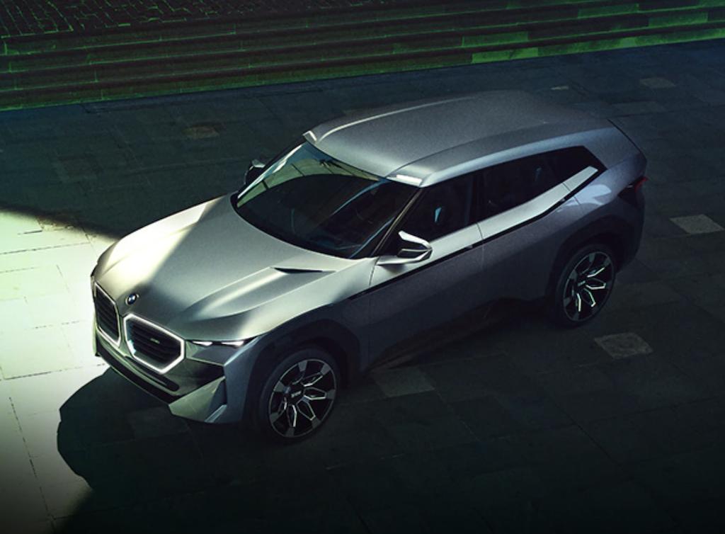
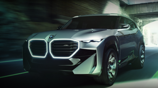
This is a new top-of-the-line BMW plug in hybrid SUV which you can tell by the M designation is a performance-oriented vehicle in this case, a two-row crossover. Now this is the concept so they could still change it a bit but I hope they get the word– it’s a mistake front to rear.
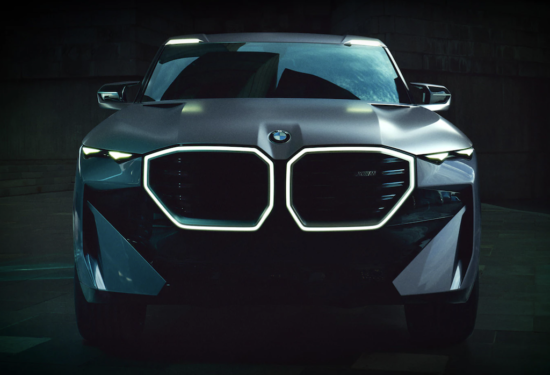
FRONT The huge kidney grilles are way too dominant. They need to be toned done or maybe add a grille flush surfaced to minimize the gaping open mouth look. The sliver headlamps are way too peek-a-boo as if they were robbers wearing face masks.
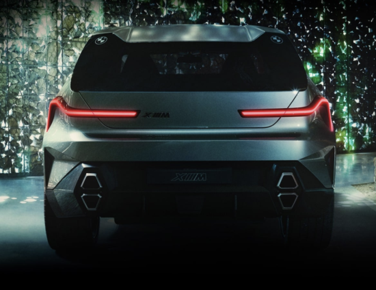
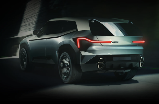
REAR There are many creases going on here and there go to nowhere–that drove Stephenson nuts. But I find the stacked tailpipes juvenile. The blade thin taillights seem to meander around to no purpose. The slab of roof hanging over the rear window is mystifying–like they were carrying plywood on the roof and the load shifted.
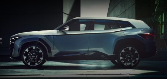
SIDE The slightly sloped roof that hints at a fastback shape shows indecision. If you want a SUV give the passengers some headroom. If you don’t care about room, then go to fastback.The abruptly ending nose is too stubby and detracts from any balance visually. One has only to look at the new Range Rover to see what a luxury SUV should look like. The fenders above the wheelwells are also odd, with two separate lines following the wheelwell shapes as if they couldn’t decide what line to follow.
IN SUM This is the choppiest design we have seen from BMW. Since it is still only a Concept they might be able to reskin it with something but even the proportions will have to be changed. Le’s hope this isn’t the lead off for all the other new BMW designs to come…
The drivetrain is a 750-hp plug-in hybrid based on a twin-turbocharged V-8. Electric only range is about 30 miles. Car and Driver sees it as a competitor to the Porsche Cayenne Turbo S E-Hybrid .
Let us know what you think in the Comments.
THE AUTHOR: Wallace Wyss, author of 18 car books, has been a guest lecturer at the Art Center College of Design.
Photos compliments of BMW.




Sure make me appreciate my 1985 M635 coupe!!
Many of the new vehicle designs, this one included, look like student projects. In order to make a statement they have way too many gestures and design elements that do not relate to each. A professional execution would have a leader theme statement, more finesse of line and form and more thought to the relationship between design elements. In an attempt to be new we’ve ended up in a deconstructive hodge pod of poor design. I’m with Frank.
As a prior owner of a few BMW’s, including a ‘73 3.0 CS, and as still an active member of the BMWCCA for the past 26 years, my belief is that BMW has lost its way. First it was the Bangle Butt and now these huge kidney grills on some models, including this design concept. This is all in addition to the proliferation of so many different series of models as to be confusing. I know they are trying to satisfy and capture an entire market of buyers and make them BMW brand loyalists from cradle to grave, but come on! In any event, the design concept is like origami gone bad. While they are trying to stretch the limits of design with this concept, it is polarizing and ultimately a failure IMO.
I sure hop BMW….and other like minded companies….. hire some Italian Design firm to help them find their way. Shopuld this make production….it will flop badly. Ugly from Every angle.
I think starting a bad design trend is a little like starting to film a movie and then you are a few days into filming and see the rushes and realize the lead actor ain’t cutting it, so you have to re-shoot all the scenes that actor was in and hire another lead (or sometimes the lead is so politically dicey that he has to go as when they fired Kevin Spacey from House of Cards) . BMW might be able to save this one The kicker is that it’s supposed to be a $125,000 car, Big Ugly Big Price
they seem to have lost the plot completely with their horrible designs lately.
NO NO NO!!! I’M TOO OLD SCHOOL. THAT DOESN’T LOOK LIKE ANY SPORTS CAR, OR HAVE ANY REAL STYLE!!
I disagree with what has been said. First it is a concept car so not everything there is meant to be on any production model. Thus, I forgive the neon front and odd quad exhaust outlets. Second in an age when all cars look alike BMW has made it look unique and made a Land Rover killer in my opinion, BMW 740 horsepower and 738 in torque WITH an all-electric mode sounds like the future to me, at least the near future. The 2022 Land Rover Defender: 296 to 518 hp and the New Range Rover is 523 hp. The BMW probably matches up well against other luxury four door speedsters too.
I happen to like the unique tail lights on the BMW and headlights minus the neon part of the kidneys but you can’t say the unique nose blends in with the rest of the crowd, I guess you could try, lol. The large kidneys first struck me as a nod to the old days when the front of an old racecar and airplane for that matter was all radiator.
I think I saw one of these last year that looked like a brown designer bag, I’ll have to go back and check my archive. This is a press photo that I blacked out the neon nose on and blended the door reflections on to make it look normal.
Rick:Your “mends” are akin to putting lipstick on a pig
A fast four door pig maybe. It looks sporty and mean to me. Just sayin’
Oink..