by Wallace Wyss –
Ya kinda wonder these mid-engined car designers—like where can they go next? Hasn’t every idea been used twice before? Well, with the new Revuelto from Lamborghini, I think in the details they did some interesting things.
Sure, it’s not groundbreaking in any way, but in this field it’s the little things that count; and hey, still being able to offer a V12 is laudable when the Electric world is closing in so fast, determined to drive ICE cars into the sea (the Revueltos are hybrids, with no less than three electric motors so they are into the EV world half way).
First I will try and explain the name: pronounced RAY WELL TOE it means a combination of things like a 6.5 liter V12 with electric power.
Now for my design comments:
FRONT At first glance it’s like a lot of Lambos but the Y-shape of the running lights is interesting. In 2023 it is more the shape of the electric lights that gives a car character, when I think the shape of a car should be judged without any electric lights. But if the lights help create an image, why not?
It’s like a beautiful female movie star—we see them only with make-up, eyebrows done, hair done, lipstick, etc. so the lights, chrome, scoop shapes and such are all cosmetic details intended to attract you. Particularly captivating is the single small white bulb on each side when the headlamps are not yet full on, a bright light in a dark background like the eyes of a black panther observing you from the bush.
SIDE At first glance it reminds you of the very current C8 Corvette style particular the lower part of the side vent. But the scoop is taller than that of the Corvette C8. A closer view reveals the nice blending of the window sill into upswept body behind the door. A good touch is the way the taillamps wrap around so the thin blade of lights continue the same shaped theme throughout the car. Really off putting is the size and shape of the outside rear view mirror. When is the NHTSA gonna let rear-facing TVs take over from rear view mirrors—it will help in slicing a point off the aero. There’s no clue there’s flip up doors until they raised up, which I think is a good thing.
REAR The rear is a busy compendium of themes. The exhaust pipes get super big attention by being up so high though you would think ICE makers would want to downplay exhaust. I would want them lower so people walking past aren’t greeted by a puffball of smoke when it starts up. The grate around the engine you see through the rear window is impressive, giving you lots of glitz to look at. And who knows once Ferrari started displaying their engines they gave owners more to brag about so why not? The rear spoiler is hidden at rest, it looks kind of like a seamless part of the body at first but works well, lifting as you accelerate adding pounds of downforce to the rear quickly as it lifts.
I’ve seen pictures of the same car with a big tall NASCAR style spoiler, unmovable, on stilts but that’s only for racetrack use.
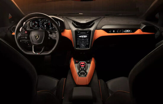
INTERIOR In the past some exotic mid engine cars went way overboard in space ship like interiors but this one is relatively modest and relaxing. A neophyte exotic car driver could take to it. The interior is simplified compared to the outgoing Aventador and uses a fixed 12.3-inch digital instrument screen and an 8.4-inch vertically mounted infotainment screen.
IN SUM The chief designer came from VW, and it is rare in the car business that you can go from designing cars for families and commuters and be asked to design a 217-mph supercar. I think he did well, and look forward to seeing one in person.
Let us know what you think in the Comments.
OUR CRITIC: Wallace Wyss is a fine artist, specializing in portraying exotic cars. For a list of works available as giclee canvas prints write Malibucarart@gmail.com
Photos compliments of Lamborghini.










Speak Your Mind