What makes for a classic look on a retrocar?
by Wallace Wyss –
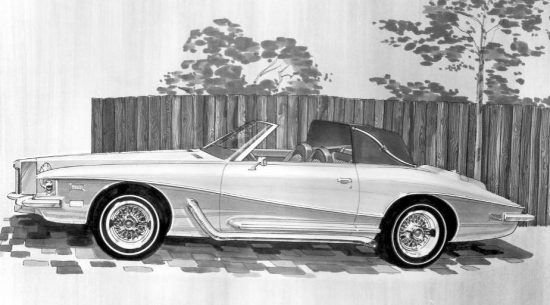
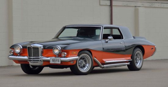
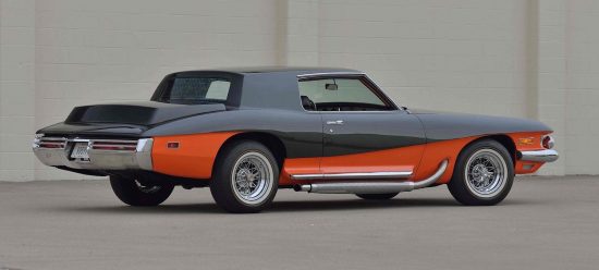
The Stutz Blackhawk, created by Virgil Exner Sr. and his son, Virgil Exner Jr., was a retro design put into production when a big player bankrolled the project.
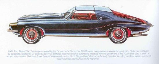
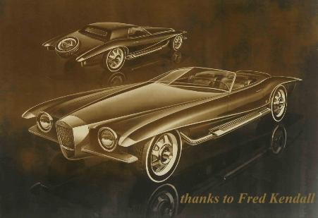
The genesis was an article in Esquire on what would they look like if four old lost brands were re-issued with modern bodywork.
At least two of the drawings received backing to be produced and one of them was the Stutz Blackhawk. The more I look at their original drawing, the more I admire how close the Exners came to achieving in real metal what they envisioned on paper.
What are the elements that make for an ultimate classic?
-vertical grille with deep set chrome
-large single headlamps (similar to Lucas P100 on prewar Rolls and Bentleys)
-bumperettes
-front fender lops stretching outward similar to Ferrari Testa Rossa (in this case capped by chrome)
-outside pipes
-split windscreen, canted back
-body accent line going front to rear along body side
-exposed spare tire in trunk lid
-on a coupe; razor edge corners on the rear
Not all of these design cues made it to the production Blackhawk; and the production cars were taller vertically, diluting the drama shown in these early drawings. Am I a sucker for a car bearing all these prewar design cues? Yes, but I doubt if any automaker could pull it off today. In effect, back then, the Exners, father and son, were pretty much given their own wonts as far as how it would look.
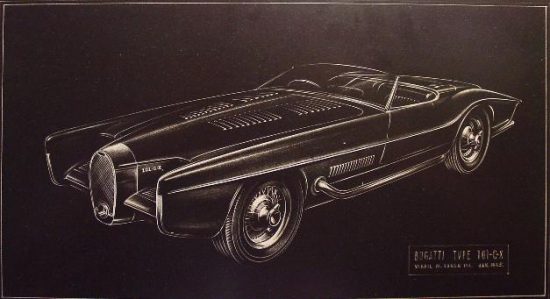
The Exners also designed a one off Bugatti on a real Bugatti chassis that embodied the same design concepts.
Only production realities called for a toning down of some of what they wanted.
Let us know what you think in the Comments.
Wallace Wyss
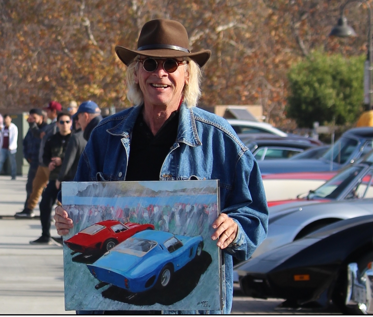
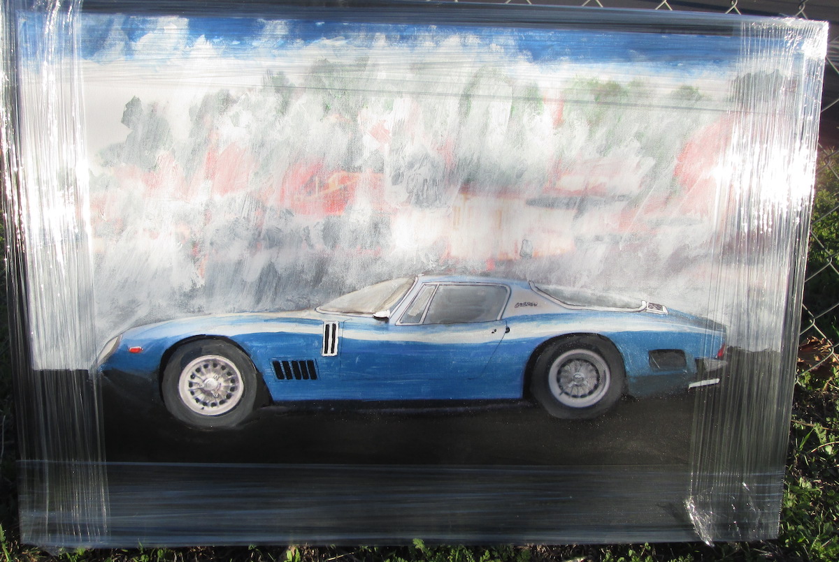
THE AUTHOR: Wallace Wyss is a painter of classic cars; for a list of artwork available, text your e-mail to 213 344 6496.


The early ones were really well-proportioned, the ones built on the shorter, later platforms looked like cartoons. I also do not agree that mainstream manufacturers didn’t stick their neck out and went with a similar formula, the boat-tail Buick Riviera is an excellent example. Just my opinion.
Best,
Jack.
. . . and the Aston Martin Lagonda–sorta.
I HAD AN 1983 LAGONDA, BUT WHEN I SOLD IT THE MAN THAT BOUGHT IT DID NOT WANT THE ENGINE AND TRANS, HE PUT IN A LATE MODEL FORD ENGINE WITH THE INSTRUMENT PANEL I LATER STARTED TO MAKE A 1932 , FORD HI-BOY ROADSTER, WITH THAT ENGINE AND TRANS, ALL XJ6 JAG RUNNING GEAR, A FIBERGLASS BODY, AND CUSTOM CHASSIS. BUT ALAS, THE PROJECT WAS NEVER FINISHED AND I PARTED EVERYTHING OUT.
This series of cars was incredibly interesting and stands out in Mr. Exners work… but then he did many interesting renders that never really saw the light of day… many of which appear in the book on his work… his son Virgil Jr is not only a very talented man but very approachable and quite nice.
THE ARTIST CONCEPTION DRAWINGS ARE ALWAYS BETTER THAT WHAT GETS BUILT. THE CAR LOOKED TO ME LIKE A CUSTOMIZED BUICK REGAL. BUT I THOUGHT THEY HAD FORD CHASSIS AND RUNNING GEAR??
Those front wheel ‘lops’ or pontoons sure look like air walls that would mess with handling and gas mileage. I think the reason all cars look the same today is they compete to sell huge numbers of cars so the common shapes that are best for mileage are used by all. When you dress up one, two or three smooth boxes you just add drag. Yes it’s sad that art is mostly gone from car design but they get from A to B efficiently. And when they drive them selves it won’t matter much anyway the kids will just ride and look at their phones.