The Kode 57
by Wallace Wyss –
Photographs by Richard Bartholomew –
Ferrari has it’s “special projects” department but I kinda think I’d go to Ken Okuyama, a handsome former professor at the Art Center College of Design, to order my custom Ferrari because he’s been there and done that for Ferrari, while he was at Pininfarina (Ferrari now designs many of their own designs, though Pininfarina is still invited to submit a design on occasion.)
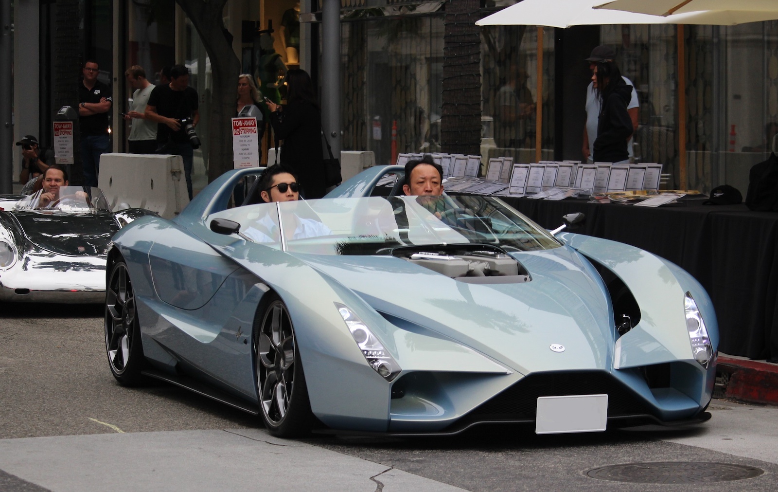
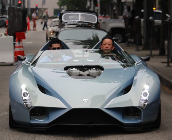
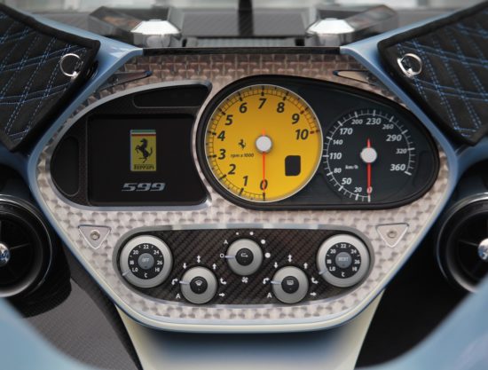
The car is actually a production Ferrari 599 re-imagined by Ken Okuyama and called the ‘Kode 57’. It is a 702 horsepower V12 open-cockpit supercar built in the spirit of open cockpit cars like the Testa Rossa back in the 1950’s. It was on display at the recent Rodeo Drive Concours d’Elegance (more on this show later this week).
There’s not only a lot of former Ferrari design cues in the car but it strongly recalls the show car Okuyama designed called the Rosso that Pininfarina built.
This is by the way a limited edition, limited to five examples, and harkens back to another creation, called the ‘Kode9’ sports coupé that can be seen in Tokyo.
After laboring in Italy, Ken now hangs his hat for Studio Ken Okuyama design in Tokyo.
To build the car he took a 599 chassis, complete with its 6.0 liter V12 engine and reduced the curb weight to 3,200 pounds (1,450 kg), mostly through replacing the chassis with an aluminum space frame. The body is carbon fiber. The quality of the bodywork is stunning.
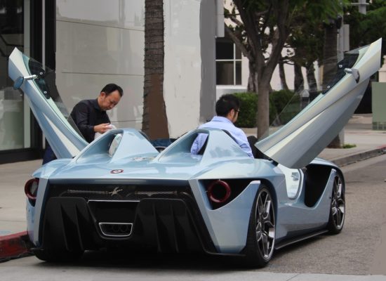
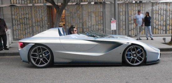
In keeping with the ‘50s look it has a classic long-nose, it’s low-slung and has a minimal windshield. One of the new things (is it the ‘70s) is the dihedral doors which give you a unique look-at-me feature when you arrive somewhere compared to ordinary doors.
One article said one of them was priced at $1.7 million. There’s more than one built by now. I am glad to see that he has, since going from being an employee to running a design business on his own, propelled himself upward to where he can build ultimate cars with historically related ultimate engines, not four cylinders or V6s. They may not be with us decades from now but right now the Ferrari 12 engines are still among internal combustion’s finest moments.
DESIGN CRITIQUE
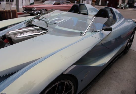
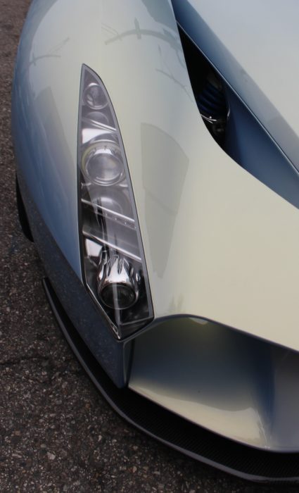
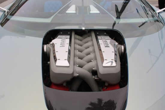
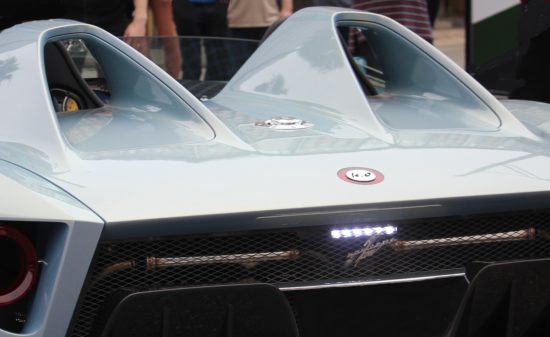
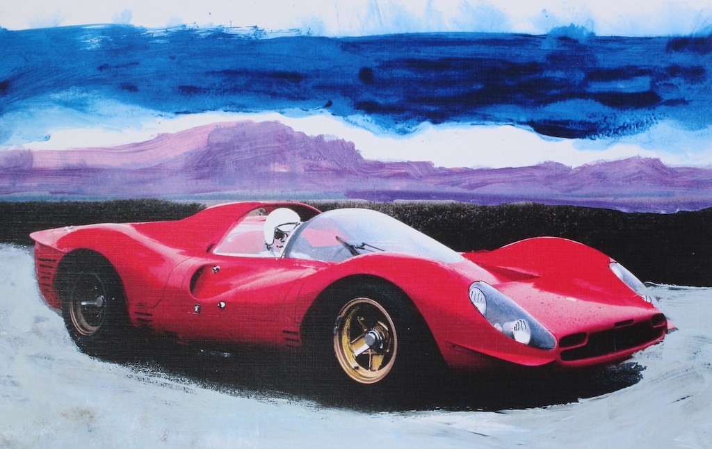
FRONT: A little too derivative of not Ferrari but Lamborghini. The engine poking through the hood is the ultimate concession to answering the question: “what’s under the hood,” though for weather considerations I would have recommended a plastic hood scoop like, egad, what d’ya know, the 1957 Ferrari Testa Rossa.
SIDE: Lots of Ferrari design cues but still a bold purposeful look. The headrest fairings are maybe 2” too tall. No clue as to which way the doors are going to open…and no top. I’d like to see the smallest of rain covers available for emergencies, similar to the Porsche Boxster “spyder” top which is tethered to mere hooks on the back deck. The wheels, alas, are just …ordinary.
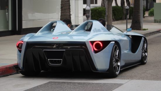
REAR: I like the big round taillamps, Ferrari-ish but bigger. And the single rectangular exhaust, as I am tired of round ones just for tradition’s sake.
All said, the car is a refreshing proof that, if you have the money, you can order a very limited edition car that is the same build quality and shows the same imagination that automakers get in their prototypes.
I think a lot of Art Center College of Design transportation design students wish they could open their own design studio under their own name but few of them make it. I am glad Ken did….
Let us know what you think in the Comments.
Wallace Wyss
THE AUTHOR: Wallace Wyss is a fine artist painting commissioned portraits of classic cars. His works will be available at Concorso Italiano in Monterey during Car Week or you can send for a list of available prints, email – mendoart7@gmail.com
THE PHOTOGRAPHER: Richard Bartholomew is an artist and photographer based in Southern California. He is open to interesting consignments and can be reached at zeroagenow@aol.com
Donate to My Car Quest – Click Here

I agree with you, I really like the V-12 poking through the hood and yeah I would like to see a plexiglass hood scoop too. The body, while “in the spirit ” of the 50’s is a little too edgy for me. I would have preferred more styling cues from a TR 59/60 design. But hey, when I scrape 2M together I can have Ken build it my way!
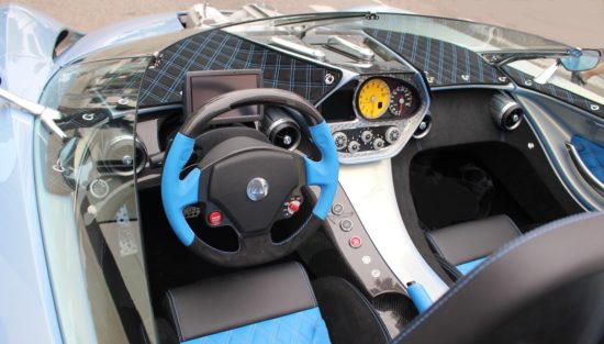
I prefer it with the license plates digitally removed and a clean bonnet. I also noticed ‘from the inside’ the fitted cloth with the square pattern on the dash was reflected heavily onto the windscreen all around. I think that would bother me and I would have the cover just one color and blend into the general interior color instead. Everyone is a critic but I can actually see what my changes would look like. I would also like one in red and one in black, does he take a check?
Note the changes our Photoshop expert (Richard B.) made to the hood compared to the original photo.
ITS BEAUTIFUL. BUT SEATS NEED TO BE SET MUCH LOWER, TO PUT THE PASSENGERS HEADS, AT LEAST 3 INCHES BELOW THE TOP EDGE OF THE WINDSHIELD. AND, THEY WOULD NEED TO BE ADJUSTABLE , UP AND DOWN , AT LEAST 6 INCHES. ALSO, HAVE SOME TILT ANGLE, VARIABILITY OF OF AT LEAST 6 INCHES, TO ALLOW DRIVERS, SOME LATITUDE FOR COMFORT AND ARM LENGTH CONSIDERATIONS. MOVABLE PEDDLES WOULD ME NICE TOO.
PS; THE WINDSHIELD ANGLE IS TOO FLAT, TOP EDGE NEEDS TO RAISED ANOTHER 5 INCHES.
Me parece absurdo…ridículo, que el borde superior del parabrisas, coincida con la altura de los ojos de los ocupantes.(butacas más bajas)…los carenados traseros, tendrían que ser más bajos (altura similar al parabrisas) y la abertura de la puerta, está demasiado atrás, lo que requiere demasiada flexión de las rodillas para entrar o salir del cockpit
Me parece interesante, la entrada de aire sobre el capot y su continuidad con las salidas de aire laterales
Google Translate:
I find it absurd … ridiculous, that the upper edge of the windshield, matches the height of the eyes of the occupants. (Lower seats) … the rear fairings, would have to be lower (height similar to the windshield) and the opening of the The door is too far behind, which requires too much bending of the knees to enter or exit the cockpit
I find it interesting, the air intake on the bonnet and its continuity with the lateral air vents
Lots of race cars have low windscreens and the occupants wear helmets with visors. So it strikes me that it may be more for the track than for the road.
But that’s the appeal of this kind of car, to look like you just ran a few laps in practice and are now going into town to a cafe. But on the other hand, I know it’s gonna rain sometimes so i want an emergency roof. Even the old ’57 Testa Rossas had a canvas rood that could be deployed.