by Wallace Wyss –
I am a fine artist. I am currently preparing some artwork for Concorso Italiano (during Monterey Car Week). In doing so, I came across a Ferrari PR shot of a ’62 Ferrari 250GTO, one taken so early it doesn’t yet have the rear spoiler which Phil Hill recommended after taking the car out on the track ( Ritchie Ginther hammered one out in a thrice).
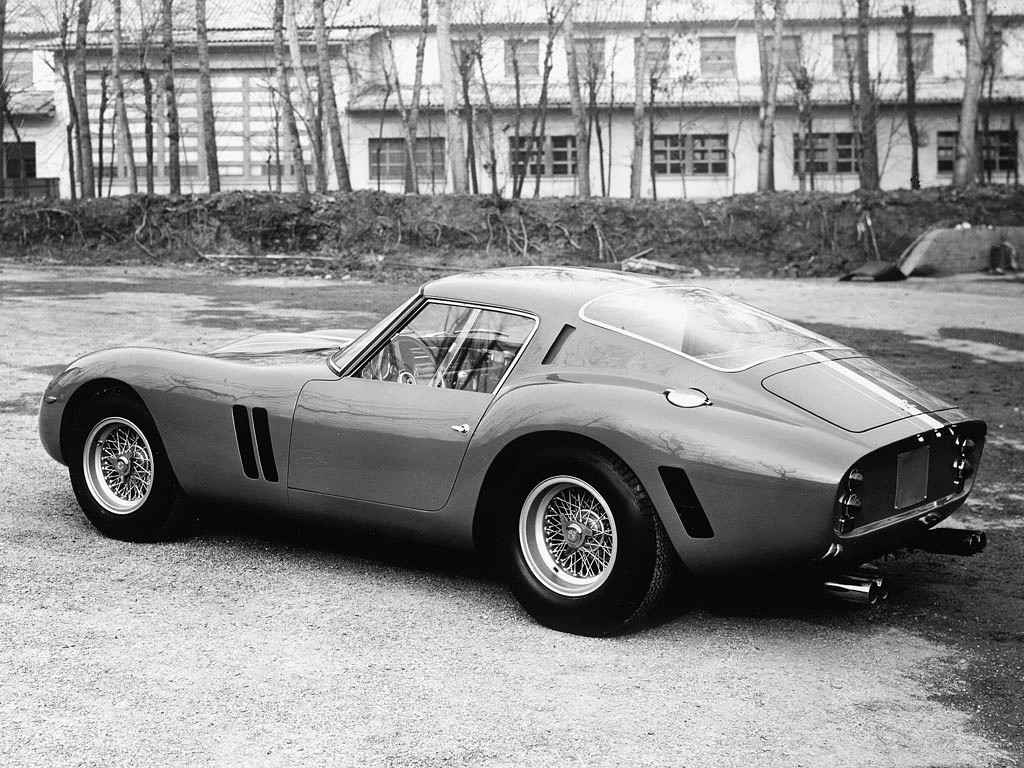
Ferrari 250 GTO
Now I might take a couple press release photos like the one I found to offer in my booth in Monterey, mixed in with, say, 100 prints of my favorite color paintings but I wonder does anybody out there even remember black and white? It’s the kind of thing you had to develop a taste for, before you were seduced by color. It reminds me of when Bob Dylan sold out and went electric (I still haven’t forgiven him for that…) Bob Dylan, the folk singer, didn’t have a chance against Bob Dylan, the rock artist.
I’ve been all through this with Ansel Adams’ nature shots. Once I could look at his
Moonrise over Hernandez New Mexico picture for seemingly an hour but now I can’t see what so entranced me.
And for those who would say “It’s a natural unretouched picture–no photoshop” in point of fact I talked to the late Mr. Adams at Pebble Beach (where he was an honorary judge) and he told me he takes several hours printing a salon print, doing something called “dodging” (moving your hands to vary the light being projected down onto the paper from the enlarger). So someone else could start with the same negative and the same paper and not get the same result. That’s where the art is.
But of course another argument for black and white is the historic significance of a picture taken way back when. Car companies used to hand out black and white prints willy-nilly in the ’30s through the ’60s. Why black and white? Because magazines didn’t print much color back then. You had a better chance of them running it if it was in black and white.
And today’s magazines don’t run them much, though, for instance, Road & Track, just to name one, has a vast library. Let’s say they’re going to pick a shot for a half a page story on say a vintage race. They think why bother with an old black and white when every page of that story has the possibility of running a shot in color that will knock your socks off?
I’m trying to like it. But it’s like when I tried to do a monochromatic painting, with black, white and a brown that imitates sienna tone. It really was annoying once I realized my palette was proving to be so limited–I couldn’t add a dash of color, not when my objective was trying to do a homage to when sienna was a common choice, considered a step above black and white (some stores developing your prints would offer it as an “antique” effect.)
So when it comes to the appeal of an old PR shot, I’d really like to hear an opinion from you out there? Are there any black and white prints on display in your “man cave?” Does anybody want them or can I count on them being cavalierly tossed aside as soon as a juicy color print of the same car comes along? I can take the bad news– it’s like if I tried to sell my old flip phone. I won’t even bother because I suspect nobody wants something that represents The Olde Way….we are, after all, in the age of the new, new, new….
Let us know what you think in the Comments.
THE AUTHOR: Wallace Wyss, a world class curmudgeon, is a fine artist based in SoCal. His Art & Books booth can be found at Concorso Italiano during Monterey Car Week.
![]()

There is a need and place for both. My home office has a B&W Jimmy Clark portrait by Jesse Alexander, a colorful, samurai warrior painting by Zane Briggs, a futuristic painting “Going, Going, Gone Bonneville 2050” by John Gable and a B&W Bonneville panoramic photo by Peter Vincent. Each work of art represents its subject matter appropriately. For this collector B&W promo photos are a great source for reference.
Try to take two idenical photos- one in with your best ‘digital’ technology and one with, say with equilavent
film. Can you tell the difference? Which one do you like?
Go into Costco and be flooded by the bright, light-like eyes of a tiger. Is that real? Does the easy flood of color on the cheap touch your secret longings? Does the technical excellence something that might inspire you to transend the ordinary the routines of survival?
I think the difference between black and white versus the rest relates to the difference between discrete versus continuous. Digital inserts artifacts into a picture. Digital is not continuous in the sense of film and light.
Is the good your soul requires need the latest computer give you 90 % proof of Fermat’s Last Theorm being true, or do you prefer an elegant penciled proof? What are the goods the notion of soul requires? When you’ve only got 12 pictures, and you have to work in the hope of getting ‘the shot,’ your effort has more meaning, because of the scarcity.
March 2021 Harpers Magazine had a one-page excerpt of a 1975 article originally called ‘ The ‘ Myth of Old Movies.’ Only they changed the tite to ‘The New and Old Movies.’ I think your black and white theme is reflected
in this article. It was television that effaced the movies’ message.
Black and white is used for a reason. The reason is that the color, in some images, detracts from the shapes in the photograph.
I have many black and white photos of family and locations in my house on display. I also have about 6-10 black and white prints – antique prints of Italy and also Kloss’s of New Mexico.
Josh Bagley
B&W
Color
Black and white looks like a news reel footage. The colorized version I did has me hearing and smelling the cars roar by and naturally gives me the feeling of being there.
Harvey’s Gmund 356 Porsche picture is so good I want to think it has muted color. It forces you to study the shape of the car, So you won me back for 5 minutes Harve, but few black and whites c an stop you in your tracks.