by Wallace Wyss –
I am a big fan of retro. I like it when an all new design takes something from the models’ history and incorporates it. Say the Bentley Continental S/C–it had a Sedanca de Ville roof that was like Bentleys of 50 years before.
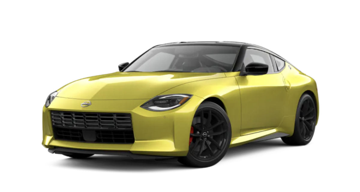
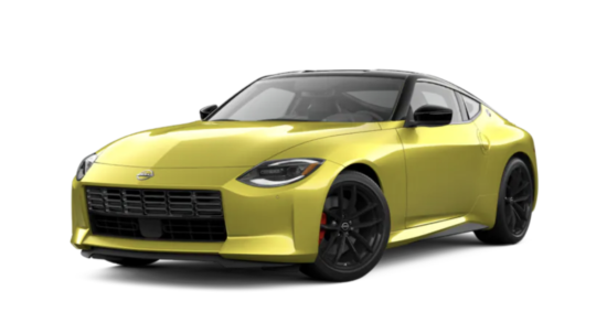
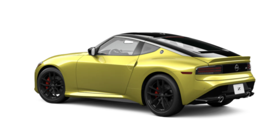
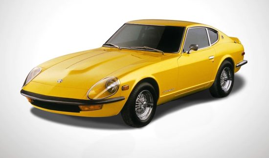
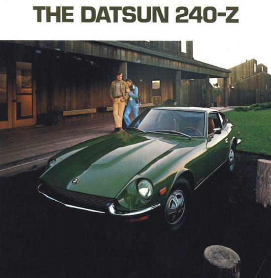
I looked recently at some pictures of the new Nissan Z and had a moment of worry–I was struck by the thought that, egad, they went too far in trying to resurrect the Z models going back to the 240Z. What made me think that was the taillights, and then the grille. Both make you think of an old used car. Not the exciting modified Z cars but some $3000 car with a million miles on it.
Considering the amount spent to tool up for an all new Z car I think they overestimated the appeal of the Z cars of long long ago. What buyer demographic were they looking for? A buyer would have to be sixty to remember the first generation Z and I have a feeling they want buyers in their 20s And 30s.
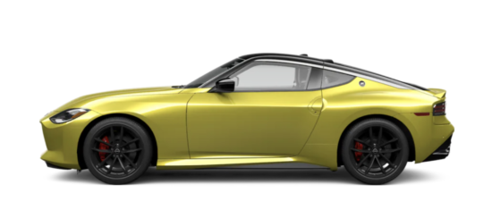
The result is that they’ve created a car that superficially looks new but still has an old look but not the boy-was-that-a-great-design feel to it. More like “there’s a tired well worn shape.” Which is a good argument for going for an all new shape. At least when Chevrolet went to the mid-engined Corvette they didn’t pack it full of design cues from the old front engined Corvette. They knew because the average new Corvette buyer was growing over 60 they had to start over on an all new shape to get the demographics down a couple of decades.
Of course, Nissan is also looking at the challenge of the coming switchover to EVs. Since it won’t have a front engine, an all electric EV Z could have a different shape. I wouldn’t advise them to go retro again because in this Z for 2023 they went too far and created a design that, while it has design cues of the ’70s, aged instantly…
Anybody agree, or not?
Let us know what you think in the Comments.
THE AUTHOR Wallace Wyss, a fine artist, has guest lectured on the history of car design at the Art Center College of Design.
Photos compliments of Nissan.


Correction- I was 30 when I owned the 240z
The 240Z is still far better looking than the most recent 350 Z cars…but then almost anything would be. I think the new look is fine, much an improvement over the last generation with its featureless bathtub look.
Totally agree. It is somewhat evocative of the original but: 1) To me, the proportions are off. (The hood is too short.) 2) the front lights are completely uninspired and miss the mark completely. Yes, the C-pillar with the “Z” logo is a nice reference, but I think it’s too little, too late. Overall, to me it is more evocative of the first gen Toyota GR86/Subaru BRZ than the first gen Z-car…
No way! That thing is beautiful. Two seats, 3-pedals, 400 horses and it looks like a lot of fun.
I love the S30 badge on the D-pillar. The lines make it look fast while parked.
You can analyze the shape all you want but the bigger mistake was the name change. Datsun built a reputation on & off the track with the 1600,2000,510,610,710,810 l 240,260,280.The Nissan name was appropriate for the orient but not for its largest market the USA.
I saw it at SEMA and in person it looks much better than this photo. Very, very cool looking!